
A long look at a QUICK STRIKE
The grim realities of a faux nuclear war plan from 1958

One of the most interesting artifacts that the National Security Archive has managed to get declassified over the last years is a US Air Force film called The Power of Decision. This was an internal USAF production, made at the request of the Strategic Air Command (SAC), produced in 1956–1957 and apparently finished in early 1958. It is a dramatic, fictionalized, but highly-classified depiction of what a nuclear war might look like from the perspective of SAC in the time period of 1958-1960. The company that produced it, MPO Productions, appears to have done most of their work as “public service” films in the 1950s and 1960s, although most were not about nuclear war. The Power of Decision is a fascinating and important glimpse at how the Strategic Air Command and the USAF saw itself, its mission, and its war.
Just this week, the filmmaker/special effects artist Peter Kuran, of Trinity and Beyond fame, released a restored version of the film that is such an improvement over the muddy, pixellated version that had been made available to the NSA. You can view it in its entirety on his YouTube channel:
There is so much one can say about it, but for the moment I want to focus on one aspect of it that I have been obsessed with for some time: its war plan. There are three war plans discussed in The Power of Decision: WAR DANCE, which is a described as “a typical war plan for our heavy units”; QUICK STRIKE, which is the dramatized war plan shown in the bulk of the film, and the one shown in the most close-up detail; and FOLLOW THRU, which is an operation that was meant to be running directly after QUICK STRIKE. Because it is the most detailed and most carefully discussed, I am going to focus entirely on QUICK STRIKE.1
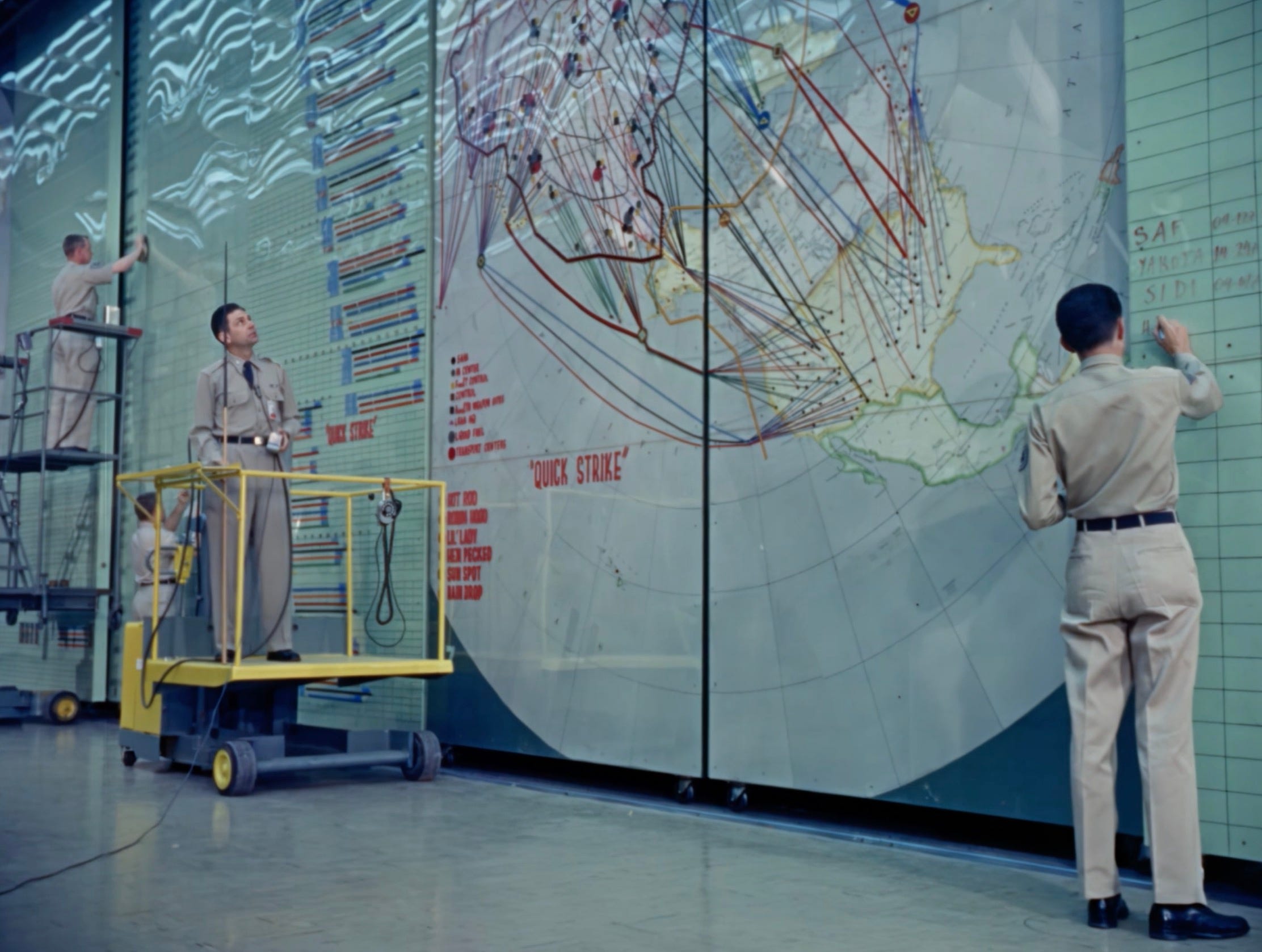
I have been pouring over the details of QUICK STRIKE for some years now. I put off writing this post until after Kuran’s restored version was posted (I had gotten wind of it a bit earlier) because I thought it would help me resolve a lot of unanswered questions to be able to see the “Big Board” — yes, that is what it is called — more clearly. Kuran quite generously also allowed met to access a version without a watermark for this post.
What has made QUICK STRIKE a fascination of mine for so long is that it is devilishly hard to get information on “real” war plans for any period, much less this bomber-centric one, in a period in which the US had vast forces to deploy. We have had previous releases that gave a sense of targets, and we know where many of the weapons were located, and we know what some of the planned “movements” were, and we know what the general philosophy of these planes were… but it’s another thing to see something that is meant to be a “realistic” nuclear war plan, made for internal, classified consumption. It is, we should note on the onset, not an actual nuclear war plan — as I will discuss, many of the details are clearly fuzzed/fabricated — and it is, even within its own context, meant to be a future war plan, but I believe it does reflect much of what we know war planning in this period looked like, and vividly so.
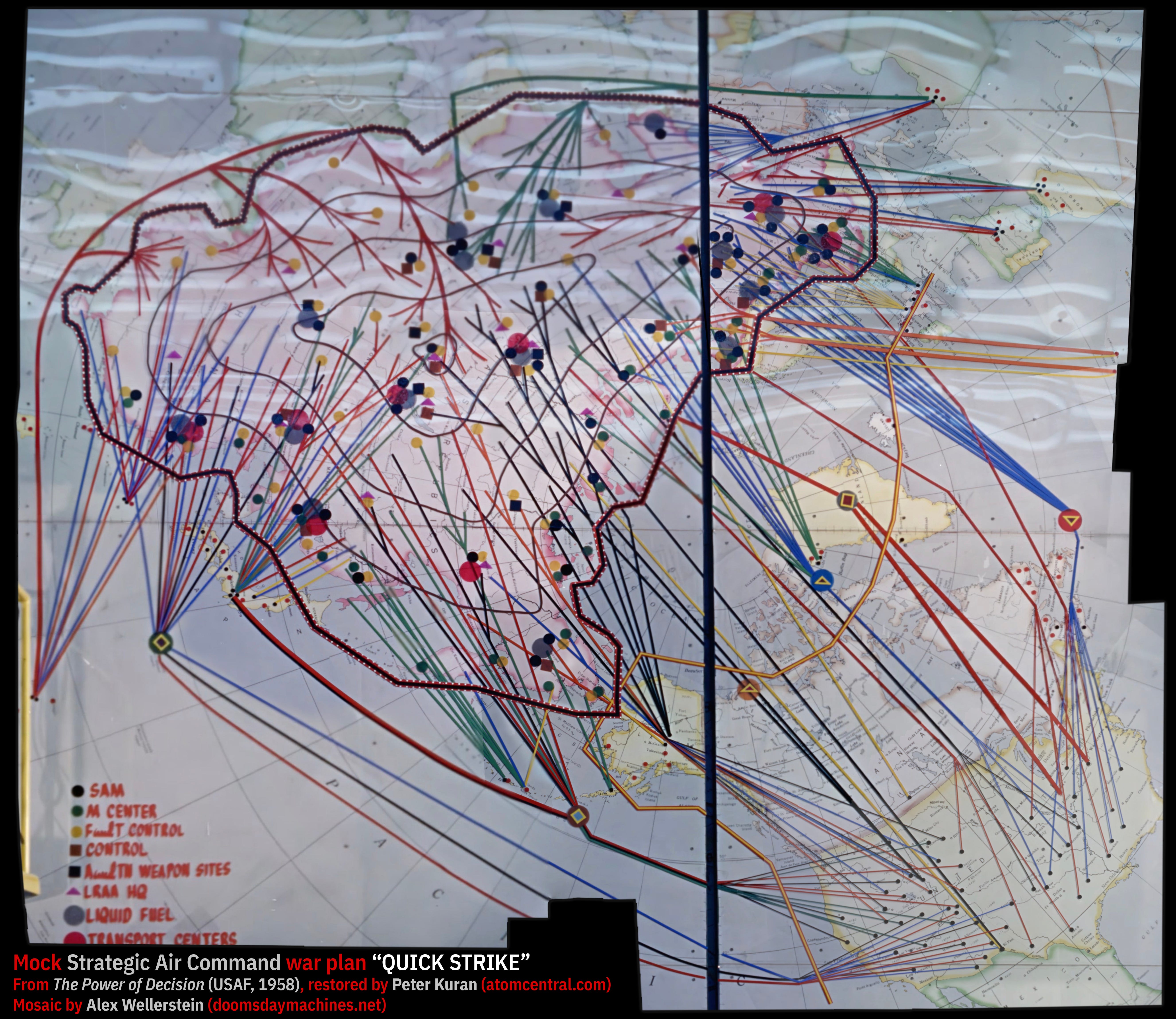
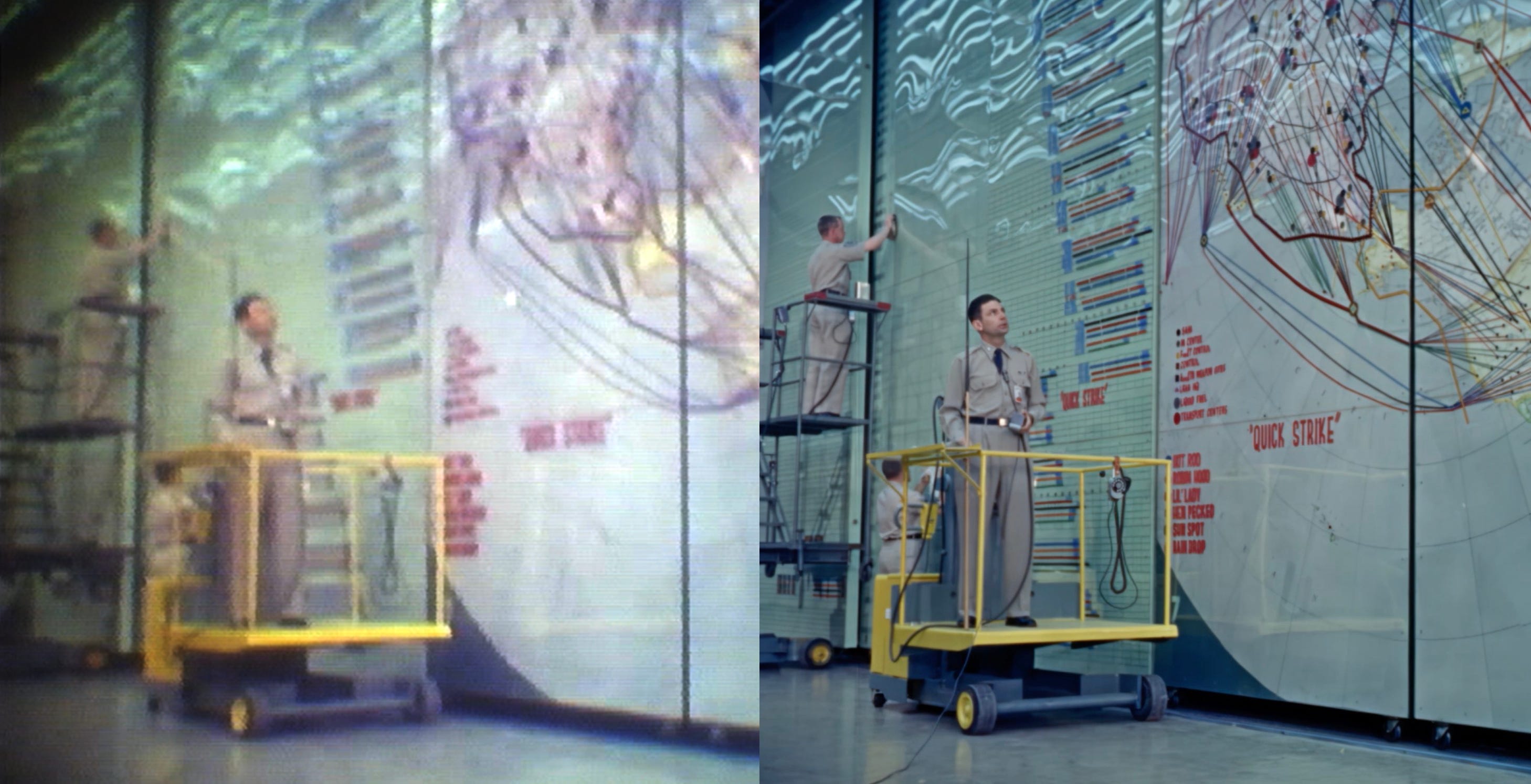
I’ve created a mosaic out of all of the screenshots of the Big Board showing QUICK STRIKE in the film. This was done with over a dozen carefully selected images of the restored film and trial-and-error with Photoshop’s Photomerge feature, careful hand-masking of layers to get the highest resolution possible, and then an overall straightening of the piece. Here it is in its “raw” form:
This map does not read itself. There’s a lot going on in it. The black spots are not redaction marks — they are just areas that do not appear in any particular frame, or if they do appear, it is at such a distance (and they have so little information in them) that it just distracts from the overall image (e.g., that small area in the Pacific, which you can see in the first film screenshot above — fitting in that extreme angle into this was not within Photomerge’s capabilities, and it did not seem worth it). I have not “filled in” any missing areas for the sake of aesthetics.
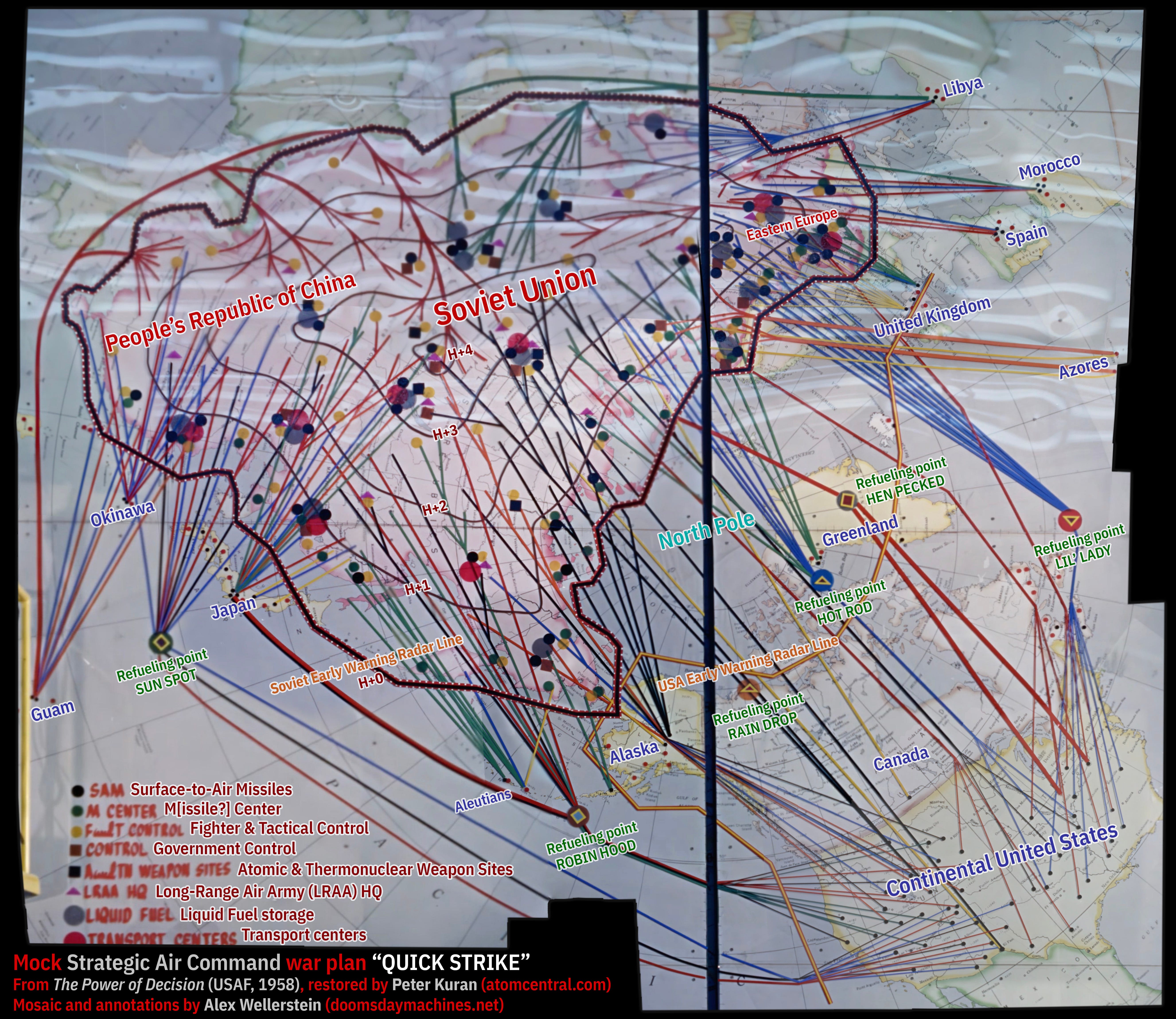
I have also made an annotated version of the above mosaic, which I will use to help “decode” and analyze the plan below. I will explain the various annotations in turn.
First, our orientation: this is a polar projection, centered on the North Pole, looking “down” at the planet. This is common for Cold War “face off” visualizations for reasons that are somewhat geo-strategically obvious: a “side-on” project (e.g. Mercator) projection obscures the distances quite a bit when talking about travel over or near the poles (especially Mercator, which dramatically distorts near the poles). So to get your bearing, take note of the North Pole (where the thick vertical black line and a thin horizontal meridian meet), and look at North America in the lower right, and Eurasia in the upper left.
There a few different pieces of information shown on this map. First is, of course, the map itself, with its representation of geographic locations. Note that the Soviet Union, the People’s Republic of China, and the Warsaw Pact states (Eastern Europe) are essentially undifferentiated and treated as one large, pink-tinged entity. We know that the war plans of this period did not allow for “de-selecting” China or other countries — it was assumed that all of Communism was the target, and the SAC planners actually resented and feared the idea that a civilian authority (like the president) would ever want to have a more “limited” plan, as Daniel Ellsberg writes disturbingly about in The Doomsday Machine.2
There are two additional sets of borders added to the “base” map: early warning radar lines (or “nets” as they say in the film). The black line with red and white borders around Eurasia is the Soviet warning network, and the yellow-on-red line around North America is its American equivalent (i.e., the Distant Early Warning Line and other radar stations).
Let’s zoom in on a screenshot of the United States:
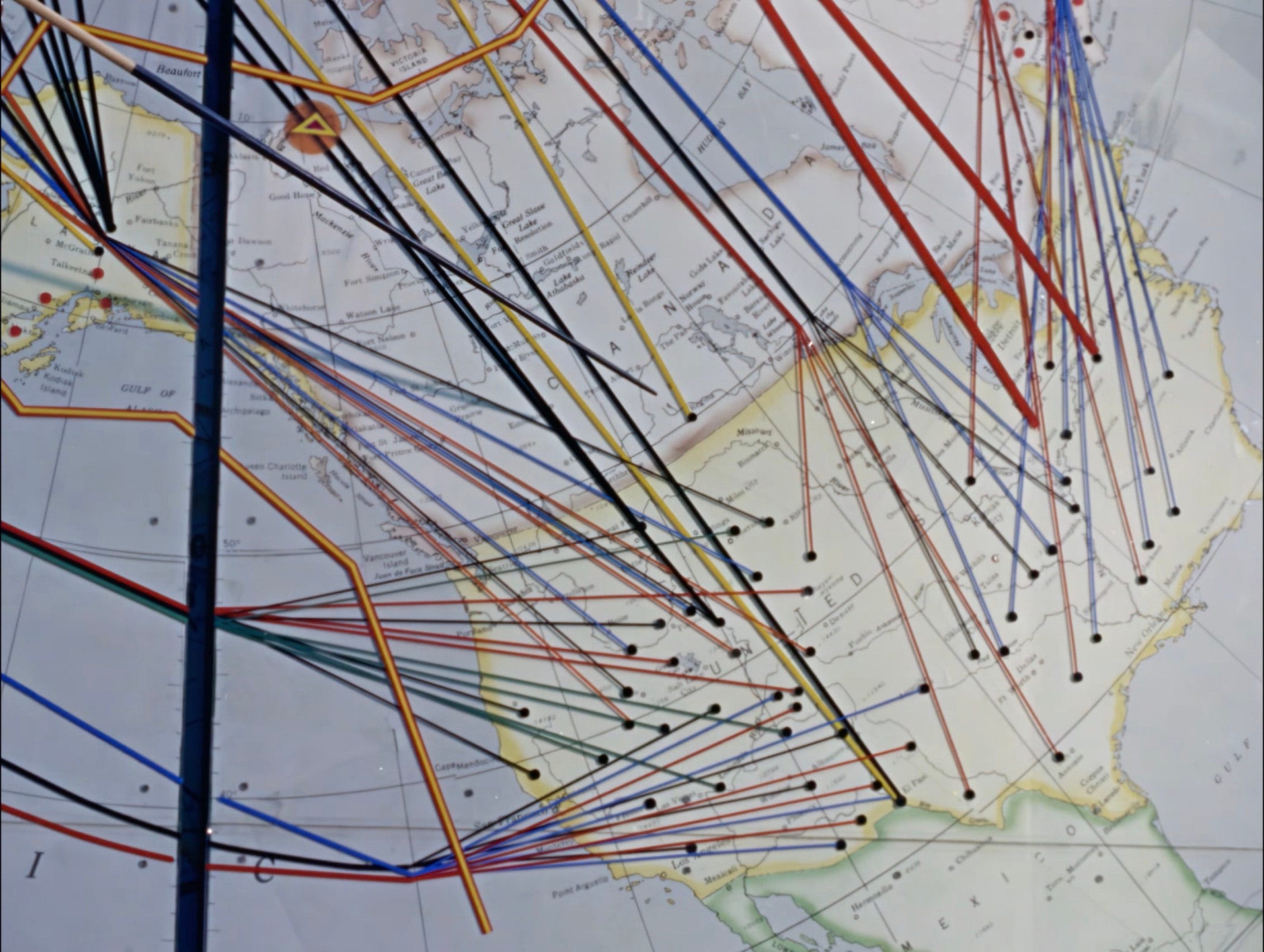
Dotting the Allied countries are red and black dots. The black dots are “launch bases”: bases that American attacks would emanate from. The red dots are “recovery bases”: friendly airfields that any plane that has survived its attacking run, or any damaged plane, could land at after their attack, potentially refueling and then participating in a future attack wave (e.g. FOLLOW THRU). In the above, you can see that all of the bases in the continental United States are “launch bases,” and that the only “recovery” bases visible are in Alaska and Canada. In the larger mosaic, you can see lots of “recovery” bases abroad (more on bases abroad in a moment).
The lines that emanate from the black dots and make their way to the Soviet Union are the attack themselves. They come in six colors: black, blue, red, green, orange, and yellow. Some of the lines converge at large colored circles with shapes on them; these are aerial refueling points, and each of them have their own code names: SUN SPOT, ROBIN HOOD, RAIN DROP (shown over northern Canada above), HOT ROD, HEN PECKED, and LIL’ LADY. Each of the different “plans” has different code names for its refueling points. These are where outgoing long-range bombers would rendezvous with aerial refueling planes, like the Boeing KC-135 Stratotanker, and take on more fuel before making their bombing run.
One important thing: the bases marked in the United States are mostly nonsense. The location of SAC bases in the USA is not (and was never) secret, and we also know (from declassified reports) where SAC stored nuclear weapons in 1958. A few of those “launch bases” are correct-enough — e.g., Amarillo AFB, March AFB, and Biggs AFB are in cities marked as bases — but a lot of actual bases are missing, and a lot of the labeled bases are just totally wrong/nonexistent. The base locations in The Power of Decision are bogus. This is something I can say with much more authority now that we have the restored version of the film, as it was harder before to see really where everything was located. Again, this is meant to be evocative of an actual war plan, and I think it is that, but it should not be mistaken for an actual war plan.
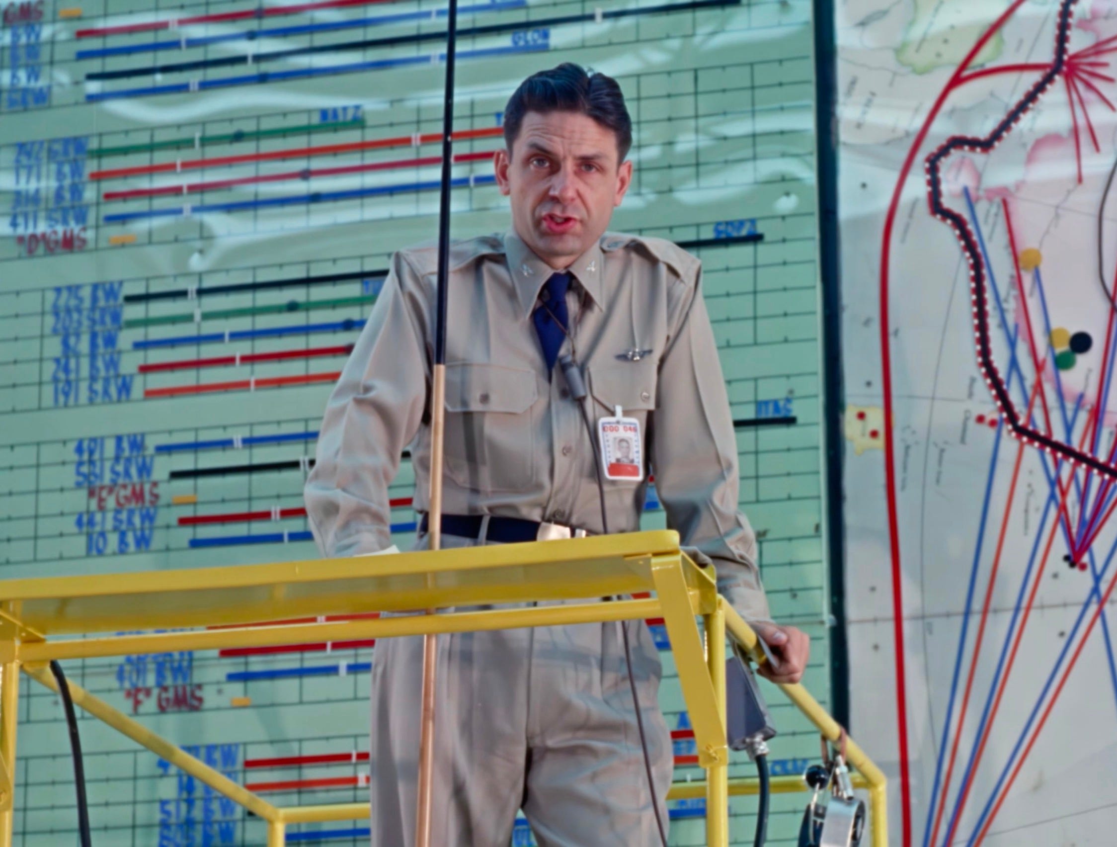
What do the colors of the lines mean? To the left of the big board, behind our narrator, is a table of lines of the same colors showing their flight times to targets. It’s not easy to see the whole thing in detail, but you can see some of it in the above screenshot. Each line in the table is labeled with one of three acronyms: BW, GMS, and SRW, each of which also has either a number (e.g. 203 SRW) or letter (e.g. “E” GMS) in front of it. So the group of lines at his elbow, above, are 491 BW (blue), 581 SRW (black, very long), “E” GMS (short yellow), and 10 BW (blue).
In Air Force lingo, a BW is a Bomb Wing, a SRW is a Strategic Reconnaissance Wing, and a GMS is a Guided Missile Squadron. The coloring of the BW and SRW lines appears to be inconsistent and without any obvious rhyme or reason; I am not sure how you would correlate the table on the left with the map on the right at all. The GMS lines are always yellow, and the short timing on the table is pretty consistent with them being surface-to-surface missiles of the sort that were just going online in the late 1950s, like the AGM-28 Hound Dog. The yellow lines are also the only ones that never branch.3
The thicknesses of the lines also seem rather arbitrary. Sometimes a thick line branches into many smaller lines, implying the thickness correlates with the number of planes, but a lot of the times thin lines also branch to similarly thin lines, and some thick lines do not branch at all. Two massive red lines that emerge from the eastern USA intersect at refueling point HEN PECKED, combine, and then just as abruptly end at the Soviet early warning line. Only red, orange, and green lines are ever thick — blue lines never are. Some of the red, orange, blue, and black lines are spindly thin. What does it mean? Perhaps nothing, in this case, but it would make sense if these lines did have meaning in an “actual” war plan, and not this “evocative” version of one.
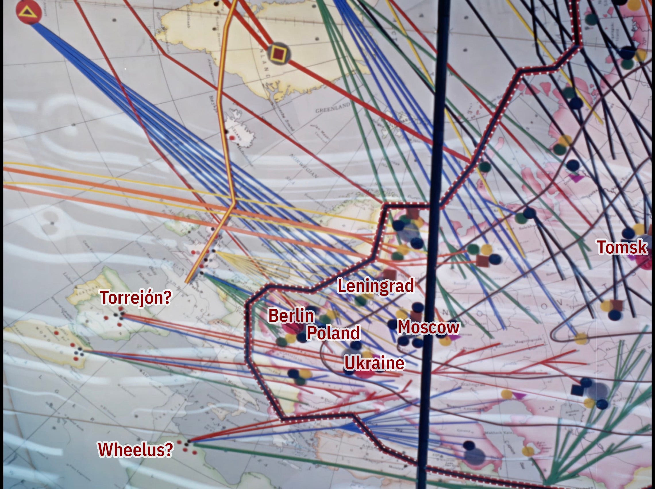
Above is a detailed screenshot of Western Europe, which I have flipped on the vertical axis so it is oriented with north being up. I want to use it to talk about both the foreign bases, and the targets.
First, on foreign bases: as you can see, there are launch bases and attack lines emanating out of bases outside of the United States. In Europe, these are set in the United Kingdom, Spain, Morocco, and Libya. As with the US detail, there are some things about this that are correct, some things that appear to be erroneous. The UK sites do not align with actual SAC bases at the time very well. The Spanish lines appear to emanate from Torrejón, but are missing the SAC bases at Morón and Zargoza. The Morrocan lines appear to emanate from a place far to the east of the actual bases (Sidi Slimane, Ben Guerir, and Nouasseur); the left-most red dot (a return base) could be Ben Guerir, but the black dots look like nonsense. Wheelus air Base, in Libya was an important coordinating base for SAC, but did not host nuclear weapons per its own internal (now declassified) lists.
One could try to make excuses for this: the verbal description of the plan in the film says that aircraft have already been deployed to forward bases, and that can mean that weapons have been moved around prior to attack. But I think it is far simpler and more likely to just assume that the map locations were intentionally obfuscated by people who wanted the attack to resemble an actual strike (with plausible countries and locations) but were not going to give actual detailed target or base information to the film crew if they didn’t need to.
Similarly, the orange lines coming out of the Azores (another detail that had confounded me until the restored film was available) are in a similar category as Wheelus: as far as I know, the Azores did not store nuclear weapons, but do have important US air bases in them.
The launch bases in Okinawa, Guam, and Greenland (Thule) do seem accurate. It is less clear with (mainland) Japan what is going on — are the bombers rendezvousing there and then continuing on, or are they meant to be actually based in Japan? Are they Strategic Reconnaissance or bombers? Japan did not (willingly) host nuclear weapons during the Cold War, although it is clear that the US did host them at Okinawa and some other US bases at times. But definitely not, say, in Tokyo, as indicated on the map.
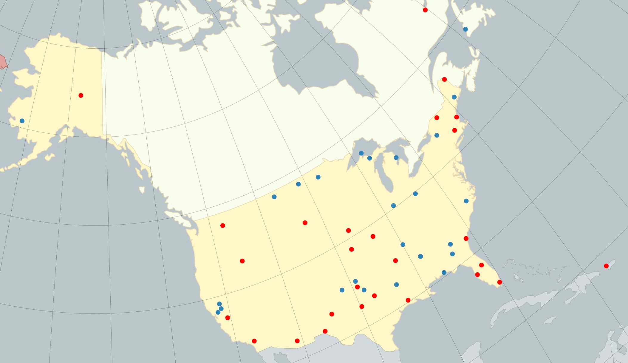
For the sake of comparison, I’ve created a quick little map, below, that approximates the same map projection as the screenshot of the United States above, with actual SAC bases, including nuclear-armed ones, shown as dots, for around the period of the film’s creation and its near-term projected future. This is not a complete map of SAC deployments at the time: the projection necessarily leaves out many, such as the weapons deployed in French Morocco (Ben Guerir, Nouasseur, and Sidi Slimane), Greenland (at Thule), Guam, Okinawa, Spain (Morón, Torrejón, and Zaragoza), and the United Kingdom (at Brize Norton, Fairford, Greenham Common, Lakenheath, and Mildenhall).4 The point here is that one can readily see that these maps do not have much in common — the data does not line up, except in a few places that might just be random.
The targets of the attack similarly look somewhat vaguely accurate, but also somewhat bogus. Yes, Moscow was heavily targeted — no secret there! As are a few other major areas, like Leningrad (St. Petersburg), Tomsk, and what looks like areas in East Germany, Poland, and Soviet Ukraine. But there are a lot of more specific targets that are conspicuously missing. The scale and scope of US targets against the Soviet Union in the late 1950s is known to have been vast.
It is also difficult, I would note, to judge exactly what is targeted. The lines of the planes sometimes end in “target icons,” but more often than not they just end in some part of the map without anything indicated. The rhetorical stance of The Power of Decision is that most of the targets are defensive or counterforce, with not much discussion of the targeting of cities or even industry. Magnitogorsk, a major site of Soviet industry, is not indicated with any target labels (you can see its label on the map), but there are some bombing routes that terminate near it. I do not suggest, again, that these bombing routes or labels are accurate, but just suggest that the plan as displayed seems to be far more extensive than the target labels would let on, presuming those planes aren’t just going to those unlabeled spots on the map and simply turning around to go home again.
The labels for the target types are mostly pretty straightforward — and primarily counterforce. “SAM” (large black circles) are surface-to-air missiles. “F & T Control” (yellow circles) are sites that coordinate fighters and tactical responses, and possibly early warning radars stations. “Control” (maroon squares) appears to be “government control” (see below) which suggests command and control sites. “A & TN weapons sites” (black squares) are nuclear weapons storage sites. “LRAA HQ” (purple triangles) are Long Range Air Army headquarters, where LRAA is essentially the Soviet equivalent of SAC (at least in SAC documents from the time). “Liquid fuel” (large gray circles) storage sites and “transportation centers” (large red cirlces) speak for themselves. The only strange one, not explained at any point in the film, is “M Center” (green circles). I had wondered if it was “military centers” but based on their placement — along the Soviet/Chinese borders, except to the south — my guess is that the M standards for “missile.”
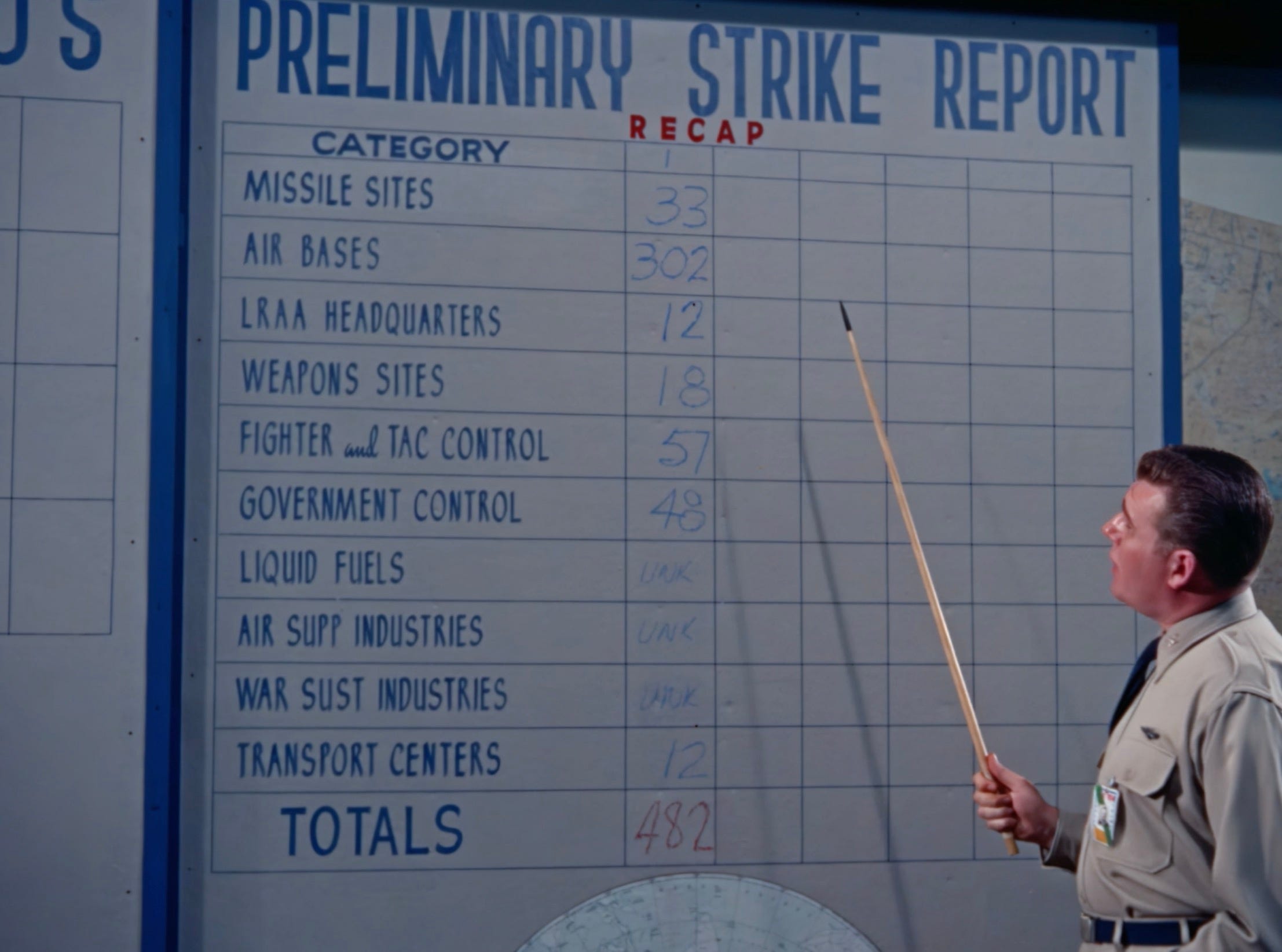
Later in the film, they do a “preliminary strike report” (above) with categories that mostly overlap with the map categories. You can see that a single category, “Missile Sites,” has perhaps absorbed both “SAM” and “M Center.” We also have a clarification that “Control” is probably “Government Control.” We also have two categories not indicated explicitly on the map: “air supp[ort] industries” and “war sust[aining] industries.” Again, all of the rhetoric of these targets is about counterforce targeting.
Lastly, let’s talk about the timing of this attack. The film explains that QUICK STRIKE is meant to elapse over 20 hours or so — QUICK by the standards of world war, to be sure, but slow by the standards of the missile age. Those concentric black lines going into the interior of the USSR, with H+0, H+1, etc. indicated on my annotated version, are estimates of a bomber’s flight time once it has hit the Soviet early warning net. So in principle a bomber could make it all the way to the heart of the USSR in 4 hours. In practice, many of them would not be trying to do that, and many would probably be shot down by enemy defenses. But, of course, they’ve planned for that. As our narrator explains:
Remember, this is a “bomb as you go” concept. Targets are bombed progressively, shallow targets first, with the strike continuing to deeper targets. This enhances the penetration capability of succeeding waves. This pattern is essential because we are playing the Soviet’s game. He picked the time of day, he knows we’re coming, we must use every trick to overwhelm him.
So if you bomb one target and then get shot down, that’s one less target for the bomber behind you to worry about.
There is no mention in the film of targeting Soviet cities, and no attempt made to estimate enemy casualties. The only casualty estimates are American ones: 60 million “personnel casualties,” 20 million wounded and 40 million dead. The 1958 US population was around 175 million, so that is a third of the country rendered dead or injured.
As a point of comparison, in the introduction to The Doomsday Machine, Daniel Ellsberg described an official report he received in 1961 that he received which suggested that the deaths in the Soviet Union and China from an all-out thermonuclear attack by the United States would start at around 275 million at the moment of war, and rise to 325 million over the next six months. Including deaths in Eastern Europe, as well as collateral deaths from fallout from just American attacks in other nations, would raise the total deaths to around 600 million, “a hundred Holocausts,” as Ellsberg puts it.5
So what is the take away of all of this? The specifics of the QUICK STRIKE war plan shown in The Power of Decision are certainly made up for the purposes of the film. But the general feel of the war plan is probably correct: in the late 1950s, the United States could, within a few short hours, mobilize a bomber force so vast, and with so much firepower, that it could exterminate the populations of multiple nations. And, in fact, this system was so rigidly constructed that they really did not have any options to limit that destruction, even if someone (say, the President) had wanted to.
The rhetorical stance of the film is meant to one of responsibility and constraint: in the film, the Soviets have started World War III, but the United States is going to end it. The actors — and again, they are all actors — do not appear to ever relish their role in the war, but they also appear satisfied to grimly carry it out. There is no hand-wringing. There is no, “my god, what have we done?” moments, as they contemplate a slaughter that would out-do the Holocaust by an order of magnitude. “Sir, we have failed in our primary mission: deterrence,” a colonel briefing on the outcome of QUICK STRIKE begins, with a dark tone to his voice. “However,” he continues, brightening, “our second mission, of destroying the enemy, is apparently fulfilled.” It’s more than a little chilling.
I’ve been teaching with the diagrams of QUICK STRIKE for over a decade now. I think there’s real value in showing how the abstractions of deterrence theory were rendered into a horrific, tangible, effective killing machine at the height of the Cold War. I sometimes have students who (adorably, naively) ask: “but would they actually have used the bomb in this way?” And being able to point to this proud, in-house, top-secret, self-congratulatory film is one easy way to answer that question. It sure looks like they would have.
There is something, too, I think, in the fact that these 1950s plans were all bomber-based: that human beings, at every step of the way, would need to carry out this horror, this atrocity. It was not a “push button” affair; while the system’s wheels were well-oiled, as the film makes clear, it was hardly automatic. You can’t blame the logic of machines for this one.
When I call this kind of thing an atrocity, I am not saying that the people who designed it, or served in it, were themselves evil. I understand full well the logic of deterrence: build the system, and perhaps it will never have to be used. But if you have, indeed, failed at your mission of deterrence — and the film is explicitly based on the premise that deterrence has failed — then what have you got? What moral shelter can one take, as one sets into motion the largest act of civilian slaughter in human history?
Daniel Ellsberg, The Doomsday Machine: Confession of a Nuclear War Planner (Bloomsbury, 2017), chapter 6.
A detail: I am not sure this list of “wings” makes a whole lot of sense on its own, but I’m not so interested as to find out. I don’t think the Air Force even had anything listed under the exact designation of “Guided Missile(s) Wing” in 1958. But I admit to finding this kind of Air Force nitty gritty dull to the point of disinterest.
The deployment and base data comes from U.S. Strategic Air Command, History and Research Division, Historical Study No. 73, History of the Strategic Air Command, 1 January 1958–30 June 1958, Vol. 1 (1958). There are other tables and reports that make it clear that these deployments are not comprehensive, as they do not seem to be counting tactical or naval weapons (which makes sense, as they would not be under SAC’s authority).
Ellsberg, The Doomsday Machine, introduction. And, as Ellsberg continues, this neglected another 100 million deaths estimated for Eastern Europe, and perhaps tens of millions more in Western Europe from fallout from American weapons, depending on the weather. ”The total death toll as calculated by the Joint Chiefs, from a U.S. first strike aimed at the Soviet Union, its Warsaw Pact satellites, and China, would be roughly six hundred million dead. A hundred Holocausts.”
Clearly the narrator is played by none other than Troy McClure.
Their was a fairly detailed paper game on this very subject, I'm pretty sure its out of print. https://boardgamegeek.com/boardgame/142480/first-strike-62