
Bananas for BRAVO
An early attempt to visualize the broader implications of thermonuclear war

The CASTLE BRAVO nuclear test of March 1954 was the largest nuclear-explosion ever detonated by the United States, and a radiological disaster. To the surprise of the scientists and military observers who set up the test, BRAVO’s 15 million tons of TNT equivalent (15 megaton) explosion generated high-levels of radioactive fallout downwind of the Bikini atoll (Marshall Islands) where it was set off.
The native peoples on the inhabited atolls of Rongerik, Rongelap, and Uterik were all forcible evacuated for their own safety, American observers on boats were themselves exposed by the test, and the crew of the Japanese fishing boat Daigo Fukuryū Maru, who had strayed into the “danger area,” were exposed to levels of radiation high-enough to make them sick and to cause one of them to eventually die.
The Armed Forces Special Weapons Group assembled one of the earliest reconstructions of the fallout plume, based on a loose model they developed on the basis of radiation readings from other atolls:
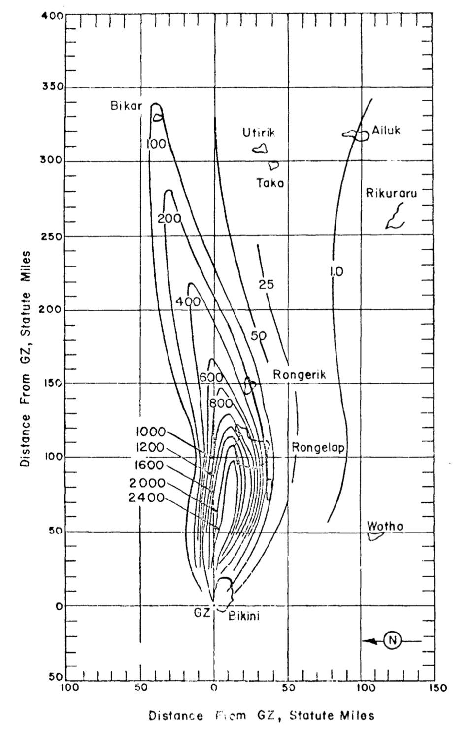
The units of the map above are of the H+1 dose rate, in R/hr, which is a standard approach in fallout modeling that can be a bit unintuitive for the average person. You can roughly consider the values to be somewhat on par with what the dose would be (in Roentgens) were you to be exposed to the fallout for a month or so. 100 R absorbed over a short period of time results in radiation sickness and an increased lifetime fatal cancer risk; 400-600 R usually results in death. So these are very high values.
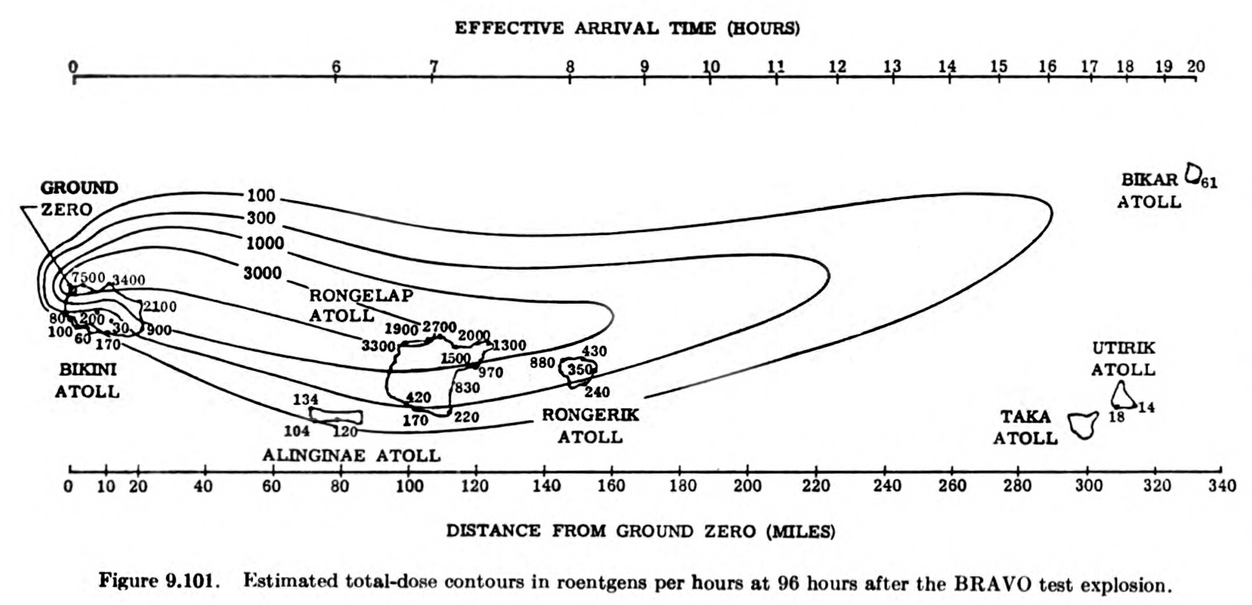
The above model was later re-rendered as the H+96 total dose contour printed in Samuel Glasstone and Philip J. Dolan’s The Effects of Nuclear Weapons, 3rd edn. (U.S. Atomic Energy Commission and U.S. Department of Defense, 1977), which people are more familiar with:
“Local” fallout contours on this level had not been contemplated prior to the BRAVO test. (Why not? That’s a longer question, one I will be writing more on in the near future…) The prior experience with nuclear fallout for kiloton-range weapons had led scientific and military planners to more or less consider this kind of downwind fallout to be a nuisance, not a serious threat, at least not compared to the kinds of threats you get from the immediate effects of a detonating atomic bomb.
Immediately, they began to ask: What are the implications of something like BRAVO for the future of nuclear war? What would happen if this weapon had gone off over an American city, as opposed to over a coral atoll in the Pacific Ocean? Which led to diagrams like the below, which transplant BRAVO’s detonation point from Bikini to Washington, DC:
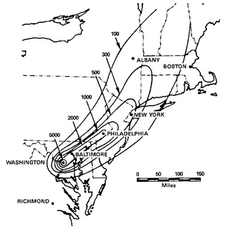
This kind of “mirroring,” in which what American did to someone else is transmuted into what could happen to America, can seem somewhat ironic, or even perverse, but it was a core part of how the United States thought about nuclear weapons and their implications for American national security. BRAVO didn’t just cause a radiological (and publicity) nightmare, it created a total re-alignment of how American war planners imagined the atomic threat. Kiloton-range weapons were comparatively limited in their scope and possibility; megaton-range weapons endangered entire regions downwind of their impact.
Which is the context behind one of the earliest attempts to systematically do this kind of analysis, a report by Lt. Col. Norair M. Lulejian, an early pioneer (for both better and worse) of nuclear fallout mapping on “Radiation Hazards During Atomic Warfare,” from November 1954, only a few months after the BRAVO disaster.1
Lulejian’s approach to fallout mapping in general was somewhat crude, fairly idiosyncratic, and could lead to some significant errors. But one has to start somewhere.
This particular report includes Lulejian’s own fallout projection method and calculations (again, far from perfect in many ways), as well as his discussion of the implications for large-scale fallout from megaton-range weapons. Some of his analysis was a herald of things to come, such as his discussion about what this level of fallout meant for future war:
In view of the fact that the lethal concentration of the radioactivity [from megaton range weapons] will cover approximately 30 to 50 times the blast or thermal damage area, it may be possible to relax the CEP [Circular Error Probable = accuracy requirements] of intercontinental missiles. As a matter of fact, it would be possible to wage atomic warfare using ballistic missiles which are intended merely to hit certain areas of the enemy country. In the case of Russia, it may be practical to develop missiles with an accuracy of plus or minus ten miles or even plus or minus fifty or 100 miles. This means that we have to forego the thermal and blast damage that we get from a bomb and use only the radiation damage parameter. If this is acceptable, then it may be possible to relax the stringent guidance problems that we have placed upon our “guided” missiles of the future.
Which is not exactly what happened — American and Soviet missiles did have accuracy requirements that were more than what would be required for just spreading fallout radioactivity as the primary effect — but the idea that fallout would be a major consideration for thinking about the large-scale impacts of nuclear missiles, and the fact that H-bombs did “relax” aiming constraints, is true.
But the most amazing aspect of this report is a figure that Lulejian constructed to make his point. Figure 11, he explained, was meant to demonstrate the “excessive contamination” that would come from several hundred BRAVO-style weapons being used against the United States. It is a thing of wonder:
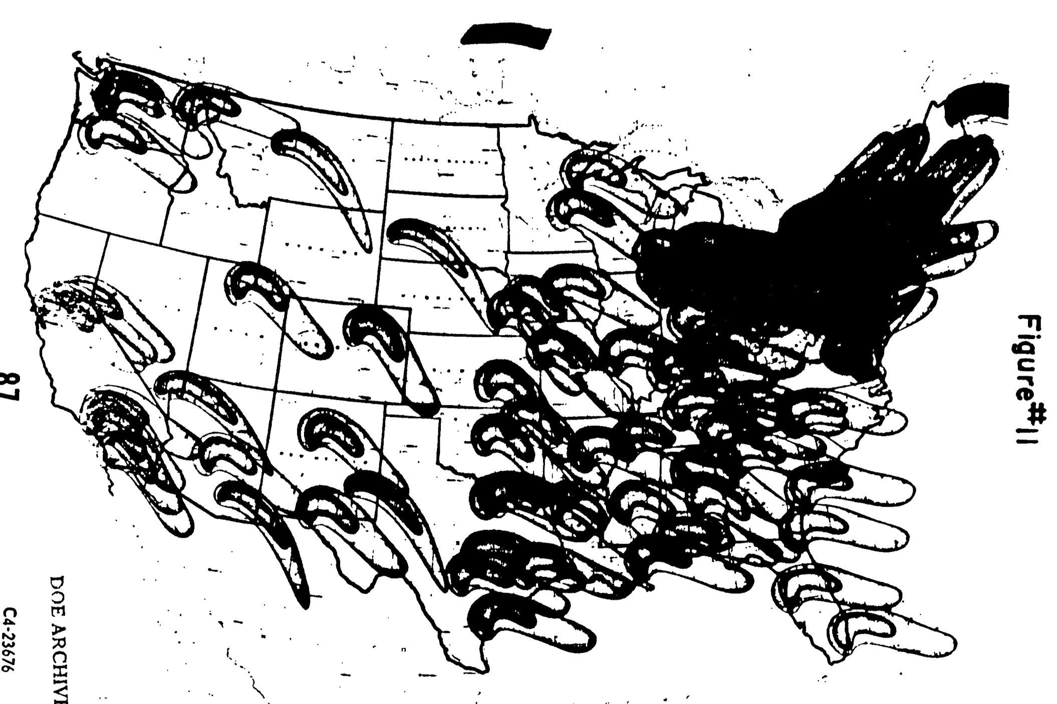
First, let us address the, err, elephant in the room. Those plumes look very much like… bananas, right? That is what you were thinking. They look like bananas. Definitely bananas. Nothing else. Just lots, and lots, and lots of bananas. A bananapolcalypse, perhaps. I think they look like bananas. What do you think they look like? Bananas, right? Definitely. Glad we’re on the same page about this.
You will notice, looking closely, that a) there are only two different plume shapes represented, and b) that they are not “integrated” at all, but rather just overlap crudely with one another. My theory is that Lulejian made two ink-stamps of two plumes with slightly different wind conditions, and then just… stamped them on. Over and over again. I am imagining his stamping of bananas on the northeast being somewhat violent in nature, but perhaps he was delicate.
He explained Figure 11 at some length:
The figure represents the idealized contamination patterns over this country, if 111 nuclear weapons of 15 MT [BRAVO] yield are contact burtst over target[s]. The targets consist of the 106 cities or this country whose population is 100,000 or more, and five selected airbases. Each fallout plot consists of two areas. The small inner areas covers 12,500 square miles and represents an average infinity dose of 2,700 Rontgens…. The large outer area covers 25,000 square miles and it represents an infinity dose of 190 roentgens…
He further goes on to explain that they did more complex analysis with actual wind patterns over targets, which was “very time-consuming and tedious” to do, and found that the “net total effect” of the variation in plumes “was the same as Figure 11”: “That is, both analyses showed that there was no place to hide in the Eastern part or the U.S. and the North Eastern U.S. was contaminated over and over again.”
It’s a grim calculus, and a grim image, even if its methodology and, er, bananas, give it somehow a bit less gravitas than the underlying topic deserves.
I read my wife your banana paragraph, and while her first impression of the repeated plumes on the map was also...uh, bananas, she just shook her head and said, "I think boys have a greater need to explain those sorts of things."
Are they taking into consideration that Bravo exploded with more power than they thought because of the extra lithium reactions they didn't know was going to happen?