

Earlier this year, Poster House — a museum in Manhattan dedicated to “presenting the impact, culture, and design of posters, both as historical documents and methods of contemporary visual communication” — had an excellent exhibit on “Fallout: Atoms in War and Peace.” I was fortunate-enough to see it before it closed, and to take part in a panel discussion there on the 80th anniversaries of the atomic bombings of Japan. The exhibit was, as the title suggests, about the duality of messages: about half of the exhibit was for posters denouncing nuclear war, and about half for posters promoting the peaceful uses of atomic energy.
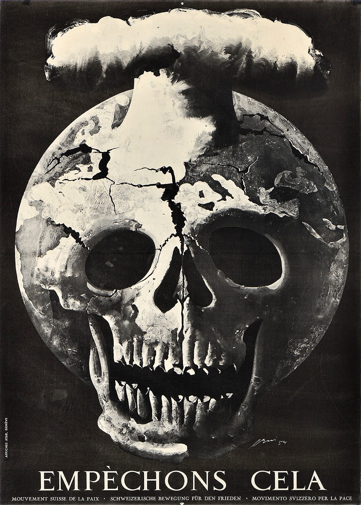
One of the earliest posters in its collection is that of Swiss designer Hans Erni, whose Empèchons Cela (“Let’s stop this”) (1955) was commissioned by the Swiss Movement for Peace and is considered one of the first specifically anti-nuclear war posters, and published with German, Italian, and French variations. The imagery is reminiscent of the some of the 1940s imagery promoting international control of nuclear weapons (like One World or None, from 1946), but is more impressionistic, abstract, and direct.
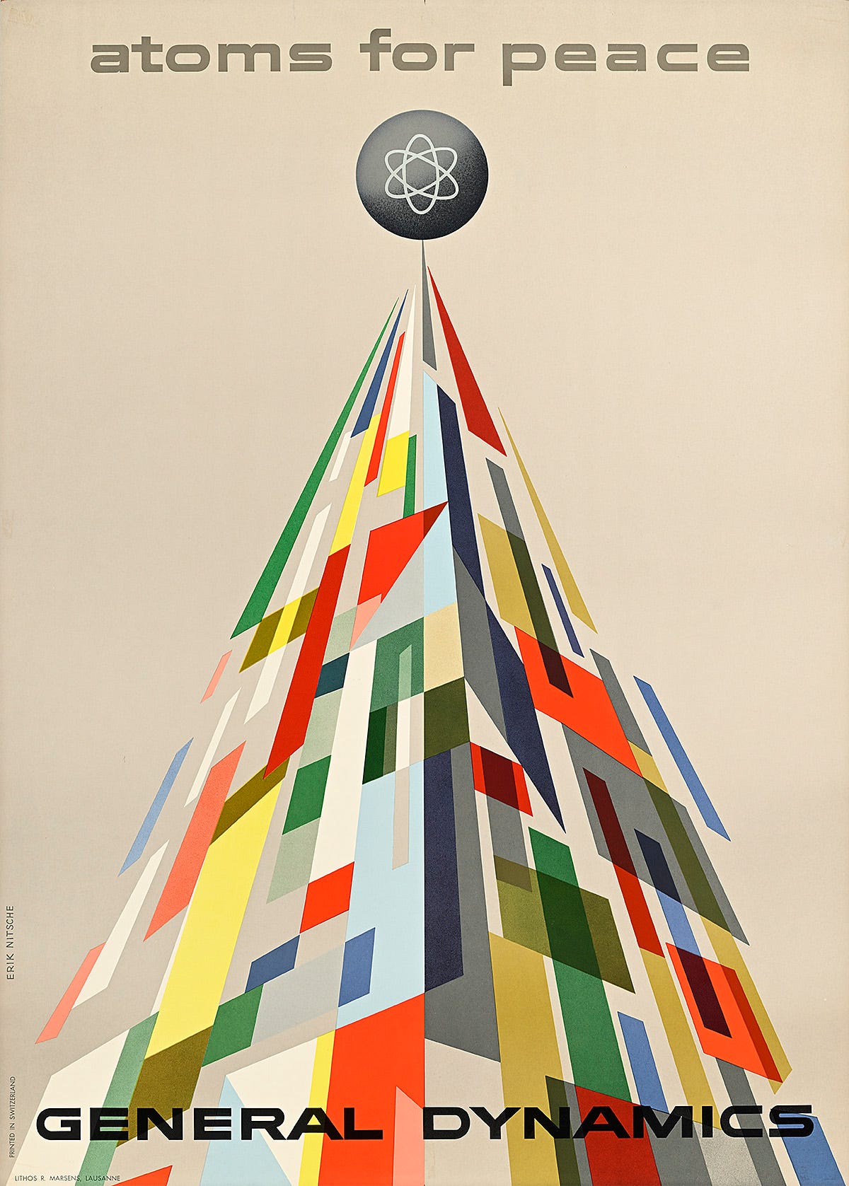
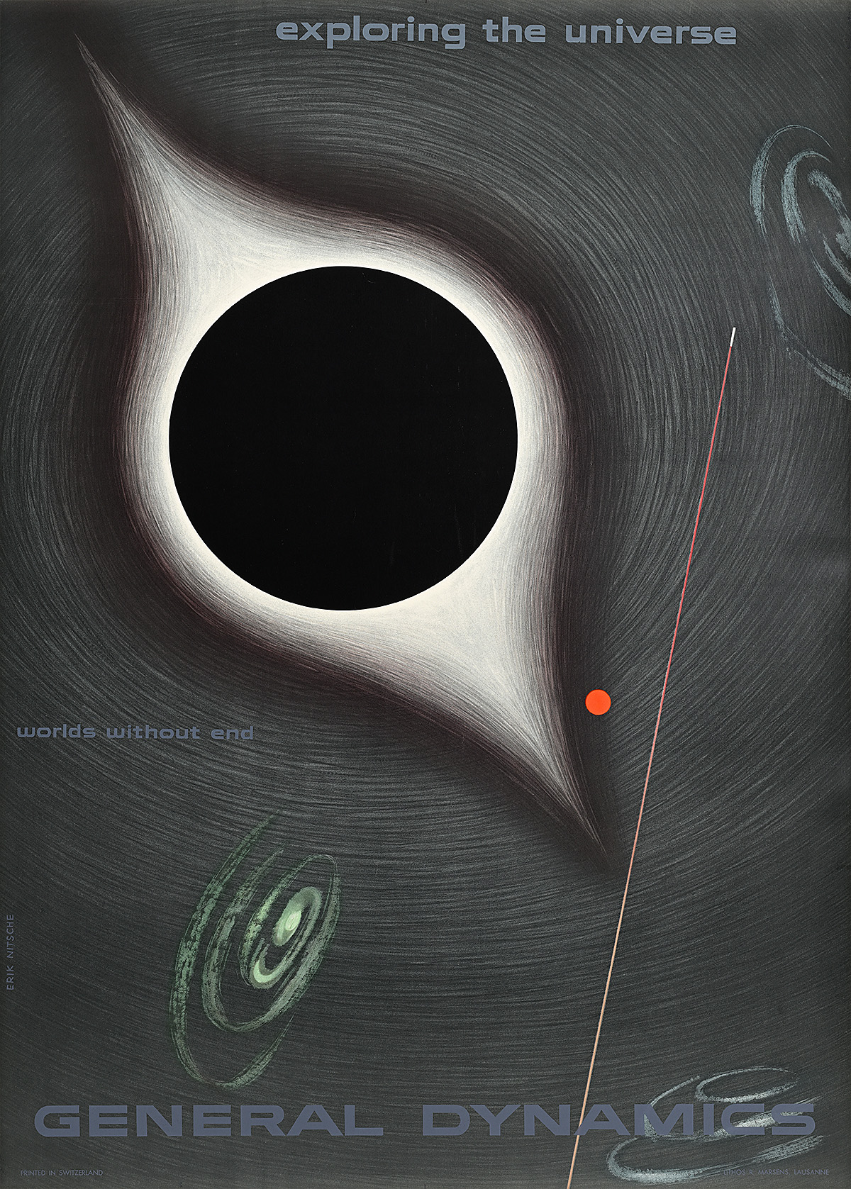
On the more cheerful side, the exhibit had the largest collection of posters by the (also Swiss) designer Erik Nitsche, whose work promoting the work of General Dynamics I have long been a fan of. The above poster, promoting the Atoms for Peace program and conferences, was published in 1955 as well, the same as Erni’s “Let’s Stop This.”
What an impressive juxtaposition they make with one another, coming out the same year, from designers both heralding from neutral Switzerland. In principle, there need not be any conflict between the two messages — one could be pro-atoms for peace, and anti-nuclear war, and many were. But one was commissioned by a “pro-peace” organization with links to the Soviet Union, and the other was commissioned by a US defense contractor.
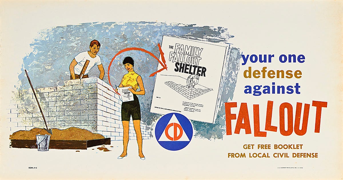
The exhibit also contained some Civil Defense posters, including the one above supporting The Family Fallout Shelter, by a “Lee,” from 1959. This is one that I have written about before, because I find it to be rather remarkable that, unlike most Civil Defense imagery from the period, it shows the female of the household both fairly fashionably dressed (not coded as merely a “mother”) and also helping, to some degree, with the construction of the shelter. Progressive stuff for the Eisenhower-era Civil Defense!
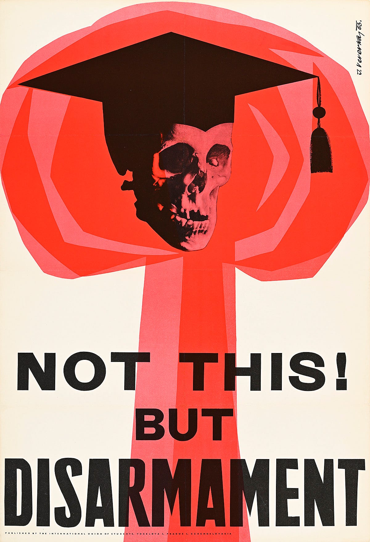
There are many other fascinating posters as part of the exhibit, most of which were purchased by Poster House for its permanent collection. The anti-nuclear ones, from the 1960s-1980s, are of varying graphical quality, but some really stand out. The one above I thought was particularly striking, like this one created by Jaroslav Veverka in 1963 for the Prague-based (and Communist run) International Union of Students, which managed, with its inclusion of the mortarboard, to make its imagery more specific and impactful than it might have otherwise been had it been left out (there are only so many skulls and mushroom clouds one can combine).
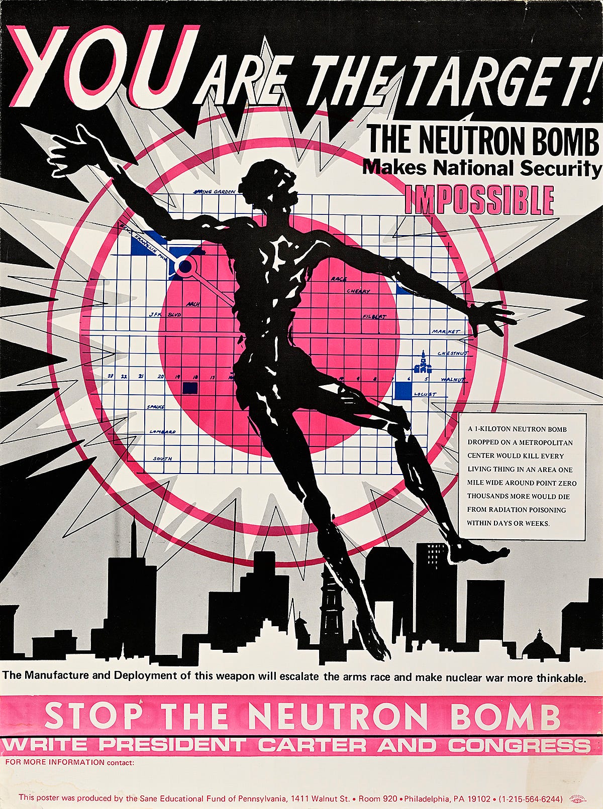
The one above, at outgrowth of the Committee for a Sane Nuclear Policy, Stop the Neutron Bomb (c. 1978), was one of my favorites of the anti-nuclear ones — it has bold imagery that co-opts the “circles of death” from Civil Defense diagrams, it makes good use of the one color, and it uses all of this in favor of a strong message (“You are the target!”) and includes a call to specific action (“Write President Carter and Congress”).
I do somewhat mourn that actual real, printed posters are such a dying art form. There’s something to a large-scale, carefully-designed, boldly printed image. The physicality of a real poster, made with offset printing, is so intense. As the curator at Poster House explained, while giving a tour of the exhibits, the rich black shades used in one of Nitsche’s later posters required multiple printing passes, all of which had to be perfectly aligned. This is not at all obvious from the online image, and the experience of viewing the posters on a screen is simply not the same. So much of the effect is lost.
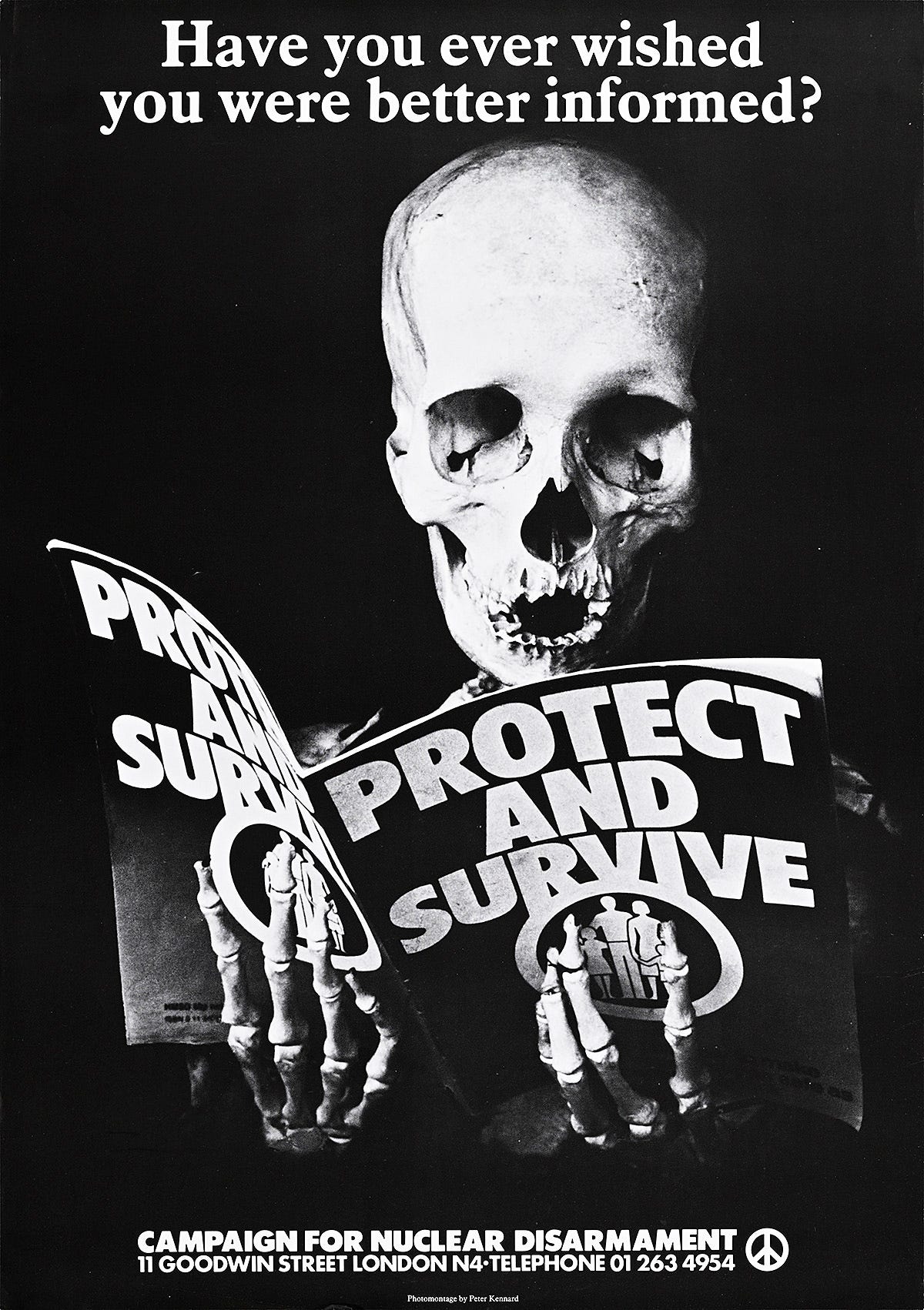
As someone who has designed more than a few posters over the years — mostly advertising academic talks — I appreciate that the work to do this sort of thing was exponentially more difficult prior to the development of desktop publishing. It has become much easier to do, but that also has robbed it of its craft and, arguably, its impact. To make something like Peter Kennard’s Protect and Survive (1980) at the time took a lot of planning, and the result is an impressive piece of design, rising to the level of art, whatever one may think about the political message it is trying to convey.
The words "General Dynamics" in Erik Nitsche's Atoms for Peace poster put a question mark in a balloon over my head. 1955? That looked a lot like, if not exactly like, the Eurostile Bold Extended font. I looked up its history. Wikipedia said that font wasn't designed by Aldo Novarese until 1962!
But before claiming that I had found a time warp, I read further. I knew Eurostile was very similar to Microgramma.
Which was also designed by Aldo Novarese, with a partner.
In 1952.
Never mind.
Presumably Erik Nitsche could have seen Microgramma Bold Extended during the three years prior to designing the poster.
(I began being attentive to these fonts around 1977. We are celebrating the fiftieth anniversary of General Technics, a loose group of science fiction fans. Among other social activities, GT started publishing fanzines. The headlines and the words "General Technics" were always spelled with waxy rub-on letters using a Letraset product, Microgramma Bold Extended. That's how I, though untrained in typography, came to recognize the font. Already it was the Font of Tomorrow, as numerous science fiction movies will illustrate. Later I learned about Eurostile, which is distinguishable from Microgramma ony to an expert.) (Yes, I came to own a copy of TYPESET IN THE FUTURE by Dave Addey, once it existed.)
I saw this show! I was in NYC for my 60th birthday celebration and happened to see an ad on the subway--my hotel was only a short walk away. Extraordinary exhibit. You are exactly right that the physicality of the works is completely lost on the internet. They lose something essential without seeing them in the correct size, with paper texture, and so forth. I wish they would tour this show (I asked, they had no plans to tour) or publish it as a book (I asked, they had no plans for a book) so I took cell phone photos. :)