
How I destroyed the world
A behind-the-scenes look at the creation of "PLAN A" (2017)

What would an all-out nuclear war between the United States and Russia look like in the 21st century? Nobody really knows the answer to that: there is no one “template” for a nuclear war, there would be choices to be made on both sides, and much would depend on the specific scenario that was unfolding.
Building up a plausible “scenario” for such a war is hard. To do that, you need a sense of targets, of attack capabilities, and targeting philosophies — as well as some sense as how these might be adjusted as things unfold. These matters are, understandably, highly classified. We have some sense of what all of these things looked like in the past, but even then there are some pretty murky areas and strong differences of opinion. And given how an actual full-scale nuclear war has never taken place — which is a very good thing! — we have a dearth of data on how these things might actually happen in the real-world.
But that doesn’t mean we can’t think about it — or that we shouldn’t. Thinking about these kinds of “scenarios” is important if we are to have a grounded, tangible, and concrete understanding of what these weapons are and what they imply about the world. And, as I think is pretty clear by now, I am one of those strange individuals who actually finds thinking about the “end of the world” quite interesting.
“PLAN A” was a project that I worked on with three researchers at the Princeton Science and Global Security Program — Alex Glaser, Moritz Bastian Kütt, and Tamara Patton — in 2017. I have only vague memories of the earliest conversations and meetings we had about it (my e-mails from the time about this start in media res, and so that suggests that we first had conversations and meetings about it prior to writing anything down about it), but my basic recollection is that there was going to be an art exhibition at Princeton about nuclear weapons, and Alex Glaser, a physicist who I have known for many years now (and written about a bit) had reached out to me about an idea they had for visualizing a nuclear exchange as part of the exhibition.
Here is the final video output, which is useful to watch before I talk about how it works “under the hood”:
At the time, I was doing a lot of programming and teaching with D3.js, a Javascript library for data visualization that has a very good support for geographic data.1 So what I believe I suggested (again, my memory is hazy on the details nearly 10 years later) is that it would be relatively straightforward to build a quick-and-dirty browser-based Javascript application that would allow one to “plug in” some data files about your nuclear attack “scenario,” and then it would allow you to visualize what it would look like. Then they could make screen captures of the Javascript application and integrate those into the final piece of video art.
I also ran the final list of “detonations” through NUKEMAP’s casualty calculator to come up with some rough numbers as to how deadly the attack would be, at least as a result of the initial effects (NUKEMAP’s casualty calculator does not, at present time, estimate possible fallout casualties).
A few years later, well after the exhibit had ended, Alex G. uploaded the output to YouTube, where it has enjoyed an amount of exposure (several million views) that nobody really expected. Because Alex G. generously (?) listed me first on the Princeton website about the video, I get e-mails periodically from people — journalists, scholars, random people — wanting to know details about the simulation. I generally send them to Alex G., because that wasn’t really my part in the whole thing.
My understanding is that Alex, Moritz, and Tamara, along with some input from the late Bruce Blair and the thankfully-still-with-us Sharon Weiner and Zia Mian, came up with the “scenario,” which unfolds over several “phases.” First the had to define a list of “locations,” each of which corresponded to icons on the map, and could be the origins or destinations for attacks. Here is an example of what the “locations” file looked like:
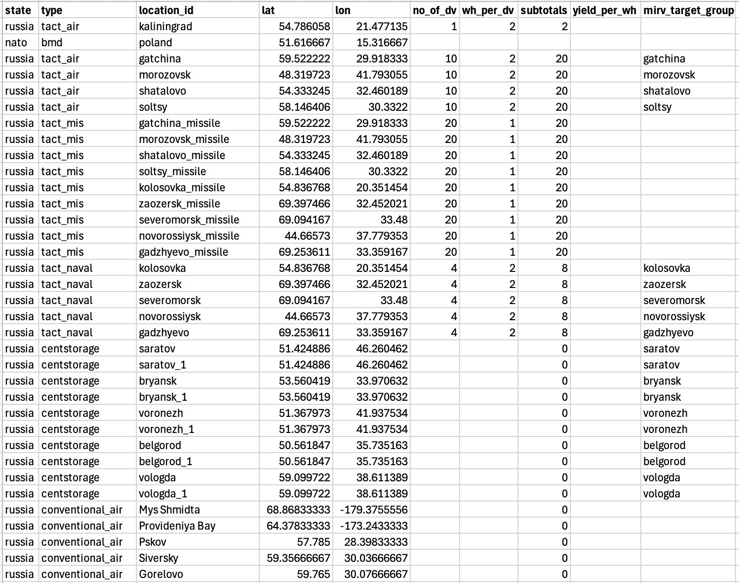
I (very unhelpfully to future me) did not document what these fields meant, but I can reconstruct most of them. “State” was either “NATO” or “Russia,” and was mostly for internal record-keeping (I don’t think it changes anything about the output). “Type” specified categories that would correspond with how the data appeared on the visualization (there was a separate file that defined what each of these appeared like, if they appeared at all — one kind of “type” was basically an invisible waypoint that planes could fly to).
Each “location” clearly had a unique ID (e.g. “saratov_1”). The latitude and longitude were its initial location, obviously. “no_of_dv” defined the number of delivery vehicles (which could be missiles or planes), “wh_per_dv” was how many nuclear warheads were contained on each delivery vehicle, and “subtotals” looks like it is just the total warheads per location if it had warheads (which I think was just for our own record-keeping; it is not used in the code). “yield_per_wh” is the explosive yield per warhead and does not seem to have been used (that would only have been used for the casualty calculation and I don’t think we used these files for that). I think “mirv_target_group” was something used for planning purposes because it doesn’t show up in the visualizer code anywhere.
Then we have the “phases,” which are the attacks themselves. These were scripted also using data files. Here’s a selection from phase 2:
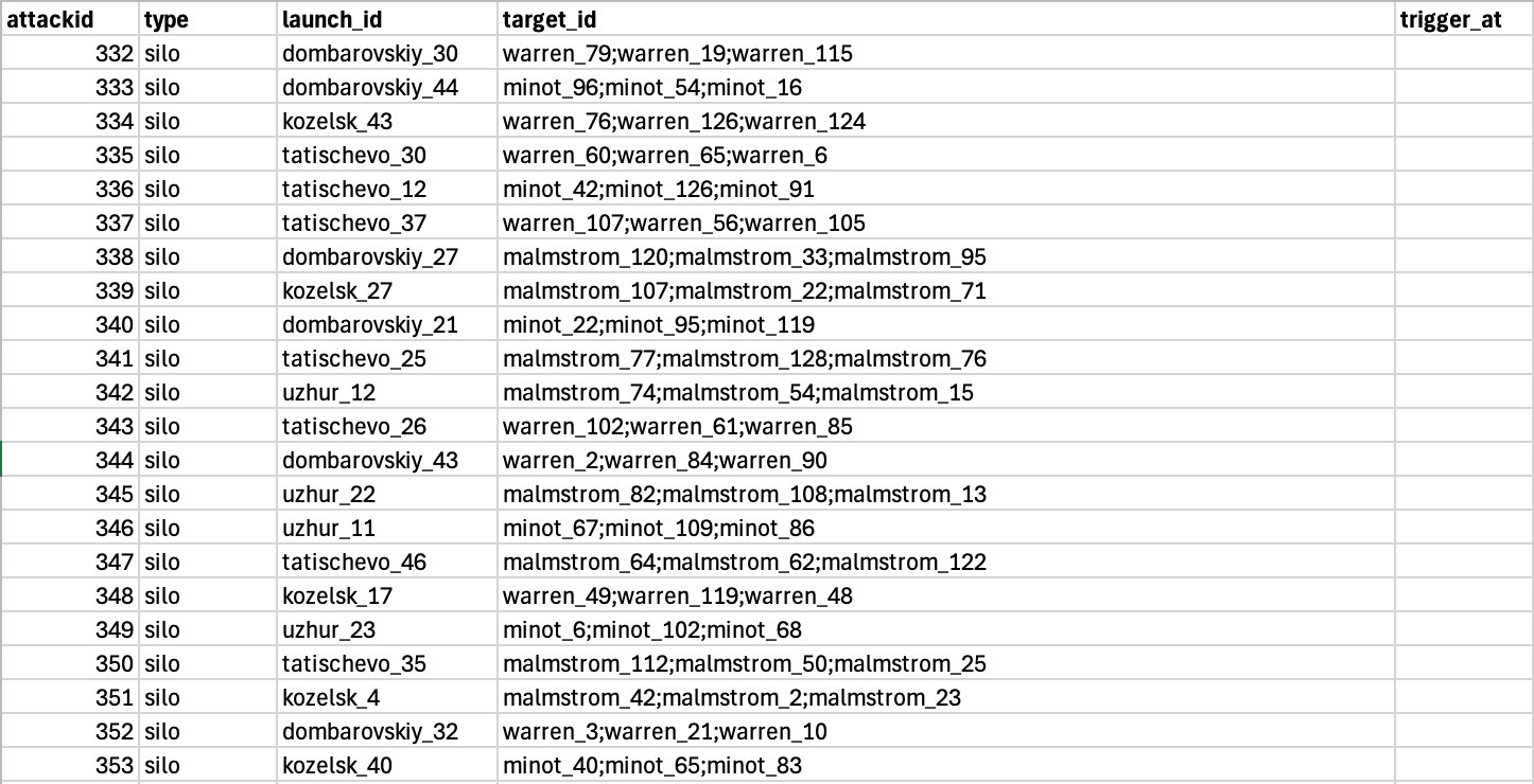
These described how and when different attacks would be taking place. “attackid” is a unique identifier, and “type” is the kind of thing that was launching the attack (e.g., an ICBM silo, a submarine, a mobile ICBM launcher, a tactical fighter, a tactical missile). The “launch_id” is the location (from the previous “locations” file) sending out this attack.
The “target_id” is a list of locations that are being aimed at by the weapon. In some cases there would be a single location, but in some, as above, you can tell they are MIRVed, and a single missile is meant to hit several different targets. “trigger_at” was a timestamp (in the above, they are set to begin immediately) at which this part of the attack would take place.
These lists were all made by hand, which is definitely not the easiest way to do it, and I’m sure it was very time-consuming! I am glad I did not have to do this part — the programming was much more fun than the tedious compilation of lists.
The code could read these data files and then “step” through the time in regular intervals, triggering, say, a missile launch, and then locating (and visualizing) where that missile ought to be at any given time after the attack. We used some very simple assumptions for the speed of everything, reasoning (if I recall) that the fine-grained differences a) would not likely be visible at this scale of the map anyway, and b) didn’t matter for the evocative purposes of this visualization (which was not meant to be any kind of “perfect” simulation). For MIRVs, the code treated all of them as the same missile until about 50% through the trajectory, in which it then split them into multiple warheads. This was, again, somewhat arbitrary.
Here is what the “visualizer” looked like in its most basic state:
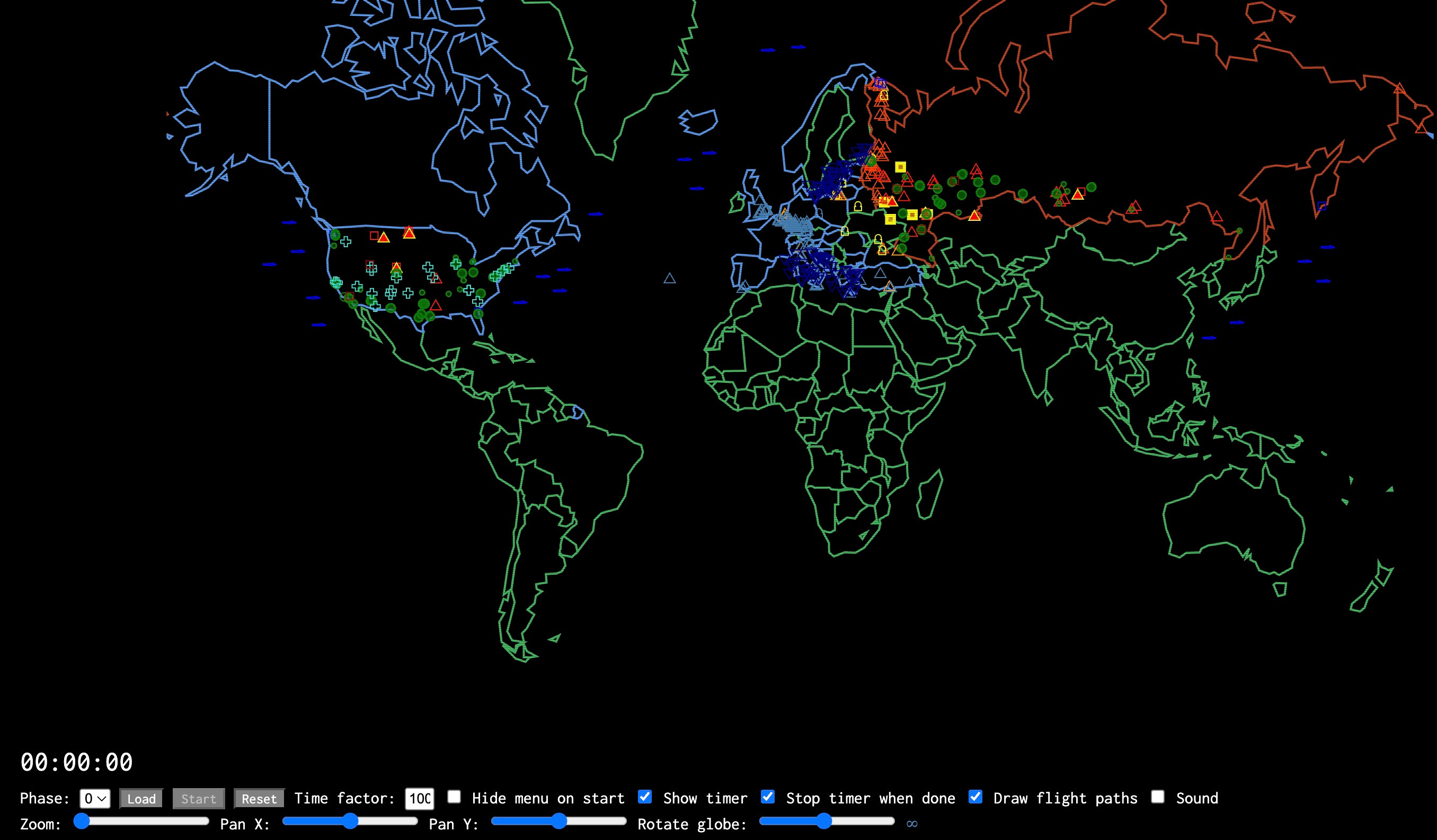
As you can see, it is a little different than the final product. It allows one to load any given “phase” datafile, and rearrange the visual display of the map, and then “start” the attack. The default time factor for development, as you can see, is 100X realtime, because realtime is slow.
How slow? Below a little screen capture I made showing the first minute of phase 2 at 1X speed.
I actually sort of love it in realtime, because while it is slow, it is not imperceptibly slow. It is disturbing to imagine that those are actual missiles, and that their slow crawl would mean that they would find targets in 20-30 minutes or so. There’s a Weeping Angels quality to it, where it barely seems to be moving at all, but if you look away and look back, you perceive the jump.
The visuals of “PLAN A” were quite deliberately and obviously inspired by the “Big Board” shown in the 1983 film WarGames:
Alex G. is fairly blatant about his nostalgia for 1980s digital culture (he snuck a Space Invader-inspired sprite into a paper in Nature, which takes some chutzpah), and I’m not opposed to it either.
I also appreciate that by doing that kind of retro visual riff, you are signaling to the savvy viewer that this is not pretending to be some kind of perfect modern simulation. I am deeply suspicion of anything that really pretends to be a perfect simulation, and with NUKEMAP and MISSILEMAP have gone to some lengths to make sure that it is visually clear that they are meant to be evocative and back-of-the-envelope, not perfect simulations.
I don’t recall it coming up in active discussions, but the game DEFCON (2006) probably informed some of my aesthetic thinking on it, too, particularly with the planes, submarines, and other little icons, which are not part of the original WarGames maps (they just have little white dots for targets). DEFCON, of course, also took its aesthetic cues from WarGames.
Another thing that I am sure we had in mind for the overall inspiration was Isao Hashimoto’s 2003 video art project of nuclear explosions, titled “1945-1998.” I am sure that at the time I said something like, “this is the kind of art that would have been pretty hard to make still in 2003 but could be basically programmed in a day a decade later,” because I am prone to say things like that.
I like Hashimoto’s piece a lot, and often show it to students in class. The almost unbearable slowness of its early periods is offset but the sudden, musical cacophony of the years of heavy testing. When things like the test moratoriums occur, their sudden silence is also quite profound, and leads to interesting conversations.
“PLAN A” is, thankfully, a work of fiction. It is a work of creativity and imagination for all involved — no less so for the programmer/designer (me) and the people coming up with the target lists and sequences (the Princeton crew). That does not mean it is not plausible or grounded. Plenty of fiction can be plausible and grounded, and plenty of even implausible or ungrounded fiction can and does reflect some kind of fundamental truths about reality. All simulations are fictions, really, and that does not mean they cannot be useful. Is it “accurate”? I don’t really know what exactly that means in this context (or how we would know).
Again, the terms I personally prefer for talking about it are evocative and plausible. At its best, it is meant to give a view of modern nuclear war that is more grounded than “everybody would die” (lots of people would die, but not everybody, for both better and worse), and is probably within some order of magnitude estimate as to what the immediate effects would be of a war of this sort, and is a not-at-all-impossible scenario that could be imagined occurring (although it is not the only possible scenario that one could imagine occurring). Evocative and plausible are really is about as ambitious as I personally would be for its predictive power, but I’m also not a scientist of any sort (“just” a historian), and so not under any obligation to aspire to much more than that.
“PLAN A” has definitely been a lot more successful, in terms of audience exposure, than anyone involved expected it to be: it was designed to be a very localized kind of art, part of a specific in-person exhibit. I think the exhibit “toured” a bit, but any art exhibit’s audience is necessarily pretty small. Its second-life on YouTube increased its reach exponentially. To what end, I have really no idea. Does watching “PLAN A” alter or affect the viewer’s understanding of nuclear war? If so, how? In what directions? Would it impact how they thought about different kinds of nuclear policies? (Does asking such a thing signal that I am thinking too functionally about art? Is it art, or some kind of design, or what? Does it matter?)
I don’t have the slightest clue about such things, to be honest — and I’m not the target audience — but I like asking the questions, and I like to believe that things like “PLAN A” might cause others to ask questions, as well.
I don’t really use D3.js much these days, and no longer recommend for people who are merely curious about data visualization and mapping in a casual or introductory way to ty to learn how to use it. Which is unfortunate, because I used to think it was a pretty good platform for beginners.
Over the past few years, D3.js’ development has gone in directions that make it much harder to make these kinds of quick “stand-alone” projects with, and far less accessible for a novice than it used to be. They also re-arranged their entire documentation for how to use it around the idea that you would be basing your work within an entirely different Javascript framework (called Observable), which adds a lot of unintuitive and non-standard programming patterns for essentially no clear generalized benefit. All of which adds up to making the library much harder to use than it was before, unless you are interested in specializing in using it. So it goes…
“At its best, it is meant to give a view of modern nuclear war that is more grounded than “everybody would die” (lots of people would die, but not everybody, for both better and worse)”
It occurs to me that nuclear war gets treated almost like if you refused to wear a seatbelt because in a car accident you would be sure to die instantly. Ignoring all the other potential outcomes that could have been avoided or mitigated with taking the extra precaution.
Kind of funny how the public has such an all or nothing, “what can you do” mentality about this or any other large scale problems (such as climate change).
I find the researched targeting choices interesting. Surprisingly, France is virtually untouched while Italy is obliterated. I would have thought the French Atlantic coast naval bases would be worth a few bombs. I was also surprised that Canada didn't get any "love." At the least I would have expected The Hole in North Bay to have gotten a couple of nukes. As you said, it's not meant to be 100% accurate, but France especially surprised me.