
"Understanding nuclear weapons"
Techno-political nuclear graphic design in the 21st century

For many years — until some kind of mandated clean-up removed all unauthorized postings — I kept a poster on my office door titled “Understanding nuclear weapons,” from the webcomic Subnormality, written and drawn by one Winston Rowntree (a pseudonym) in 2010:
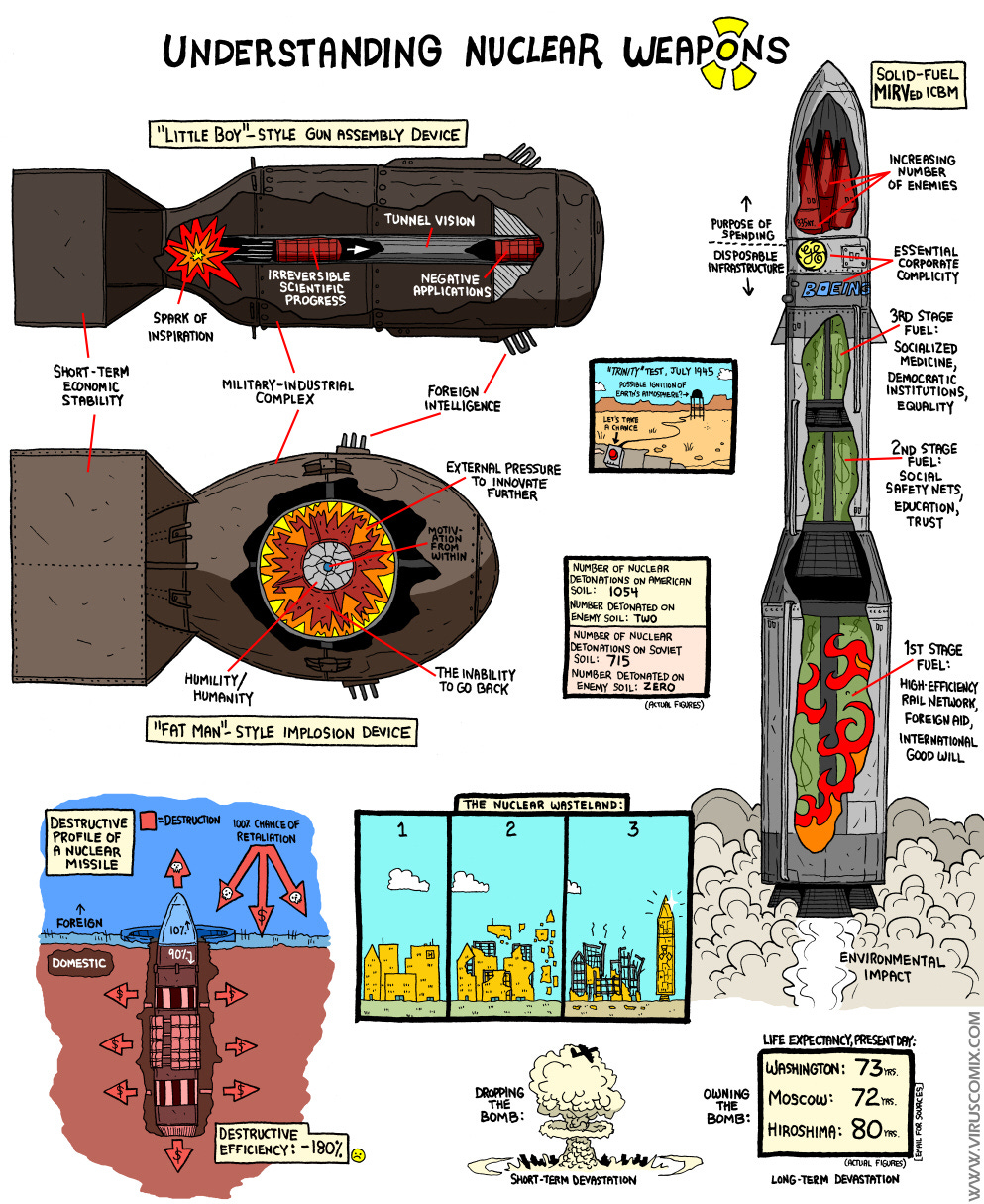
It has long been one of my favorite “takes” on nuclear weapons, as it is complex both in its aesthetic allusions as well as its social-political-historical arguments. The author has given me permission to post it, so let’s dive into a few parts of it.
First, we have the obvious “weapons diagrams.” As someone who is something of a connoisseur of diagrams attempting to depict the operation of nuclear weapons, I am extremely receptive to what is going on here:
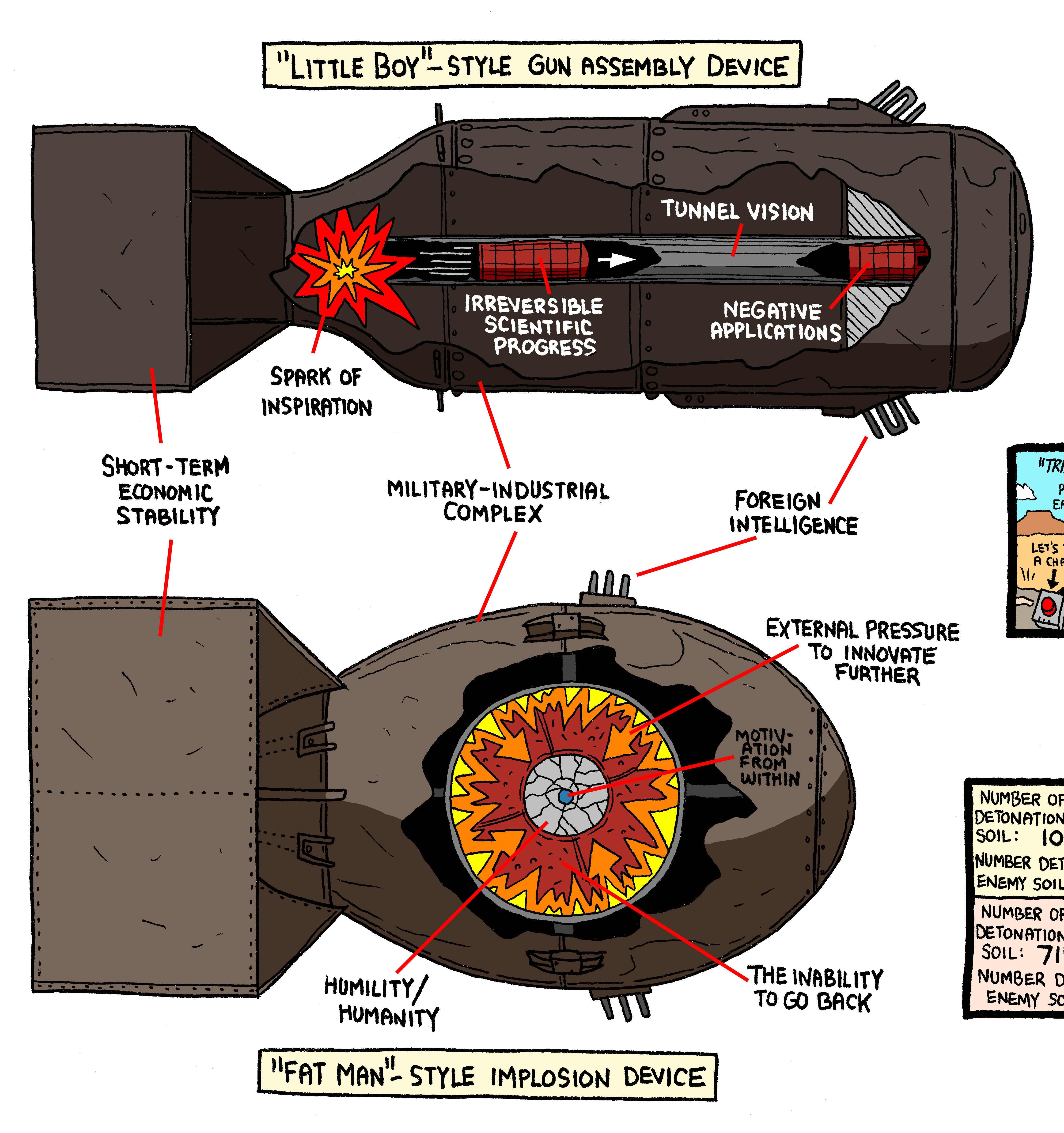
The basic aesthetic choices here are straightforward: take the “encyclopedia-style” depictions of Little Boy and Fat Man, and change the labels to suggest political and social explanations for “how they work,” as opposed to purely technical ones. The choices are not arbitrary — “motivation from within” is the neutron initiator, the transformation of the shock wave from an explosion to an implosion renders “external pressure to innovate further” into “the inability to go back,” and the gun-type’s internal gun barrel is “tunnel vision.” One could imagine just re-labeling these things haphazardly, but that isn’t what is going on here.
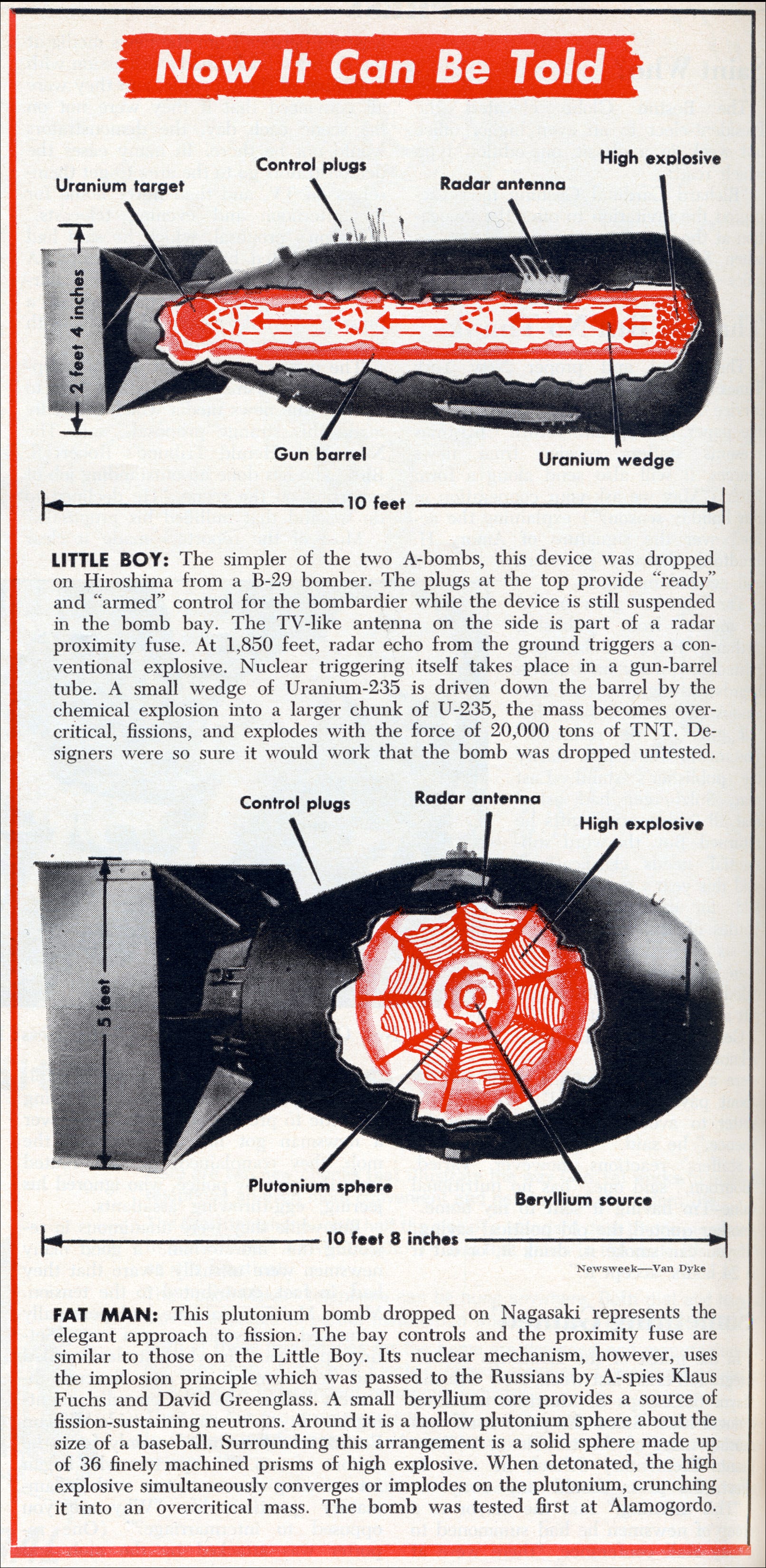
The actual image is based on a trope that started in 1960, incidentally, after the first images of the casings of Little Boy and Fat Man were declassified, and publications, starting with Newsweek, began making hybrid diagrams overlaying basic functional diagrams weapons onto their realistic external appearance:1
I have studied the history of nuclear weapons design diagrams extensively, cataloguing some 170 of them over the years, in American, Russian, and even Chinese sources. I am not sure I have ever seen them used in quite the fashion that Rowntree does, with political arguments about the weapons accomplished through clever re-labeling — it is somewhat obvious once you’ve seen it done, but I’ve never seen it before.
The other images in the diagram are about the costs of nuclear weapons. Specifically, they are about opportunity costs, not just resources exhausted. The real costs of nuclear weapons, Rowntree argues, are about what it does to your society — what it precludes. The missile diagram on the right makes this very explicit: the “purpose of the spending” (a small number of MIRVed warheads) leads to the burning of international good will, a social safety net, democratic institutions, etc. There are some more subtle graphic depictions of this in the smaller graphics, like this one labeled “the nuclear wasteland,” in which a functional city is reconfigured into a missile:
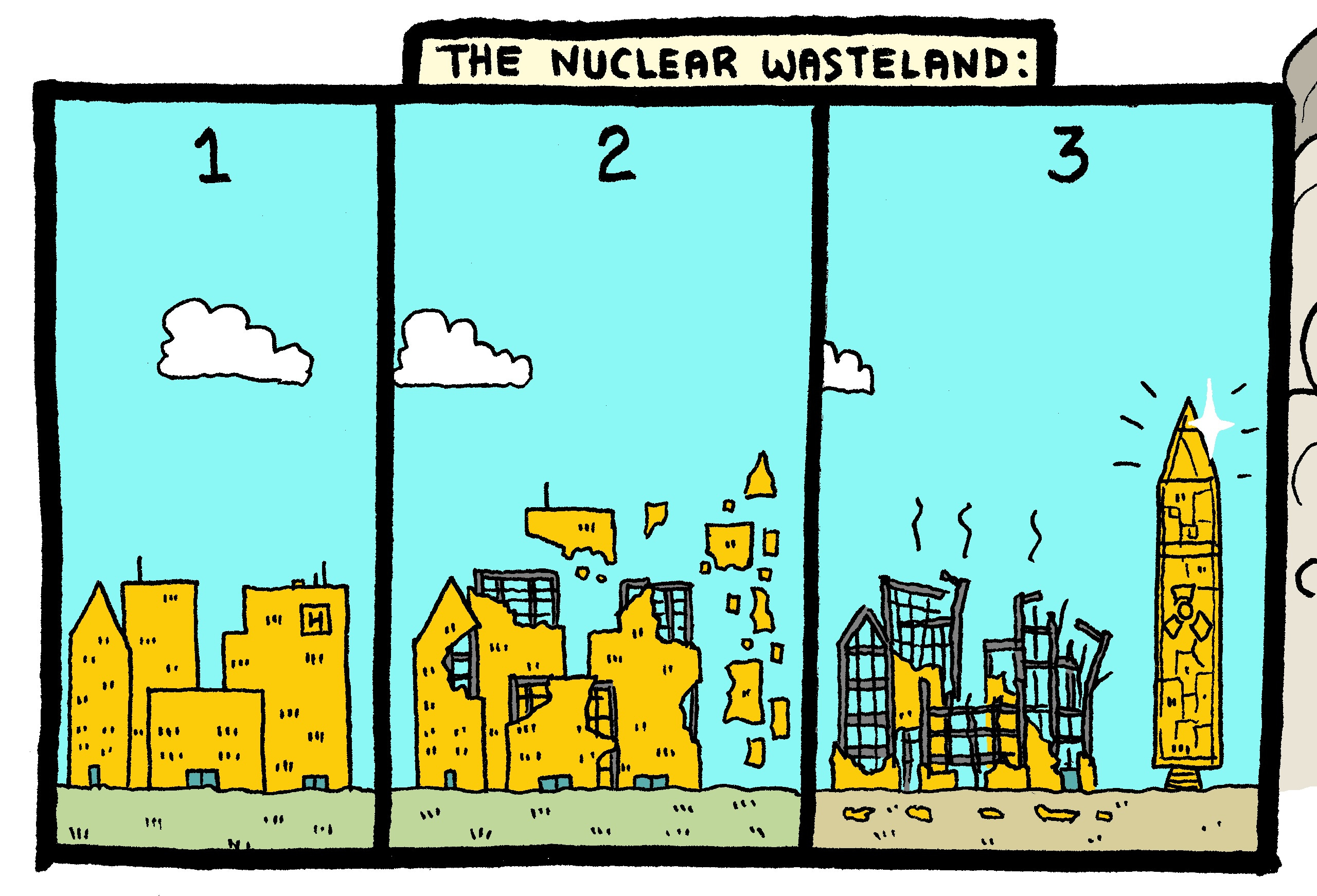
This is very reminiscent of an argument made by that known socialist and hippy, Dwight D. Eisenhower, in his 1953 speech “A Chance for Peace”:
The best [outcome of the arms race] would be this: a life of perpetual fear and tension; a burden of arms draining the wealth and the labor of all peoples; a wasting of strength that defies the American system or the Soviet system or any system to achieve true abundance and happiness for the peoples of this earth.
Every gun that is made, every warship launched, every rocket fired signifies, in the final sense, a theft from those who hunger and are not fed, those who are cold and are not clothed.
This world in arms is not spending money alone.
There is a further small diagram that takes this theme in the direction of the human costs of nuclear weapons:
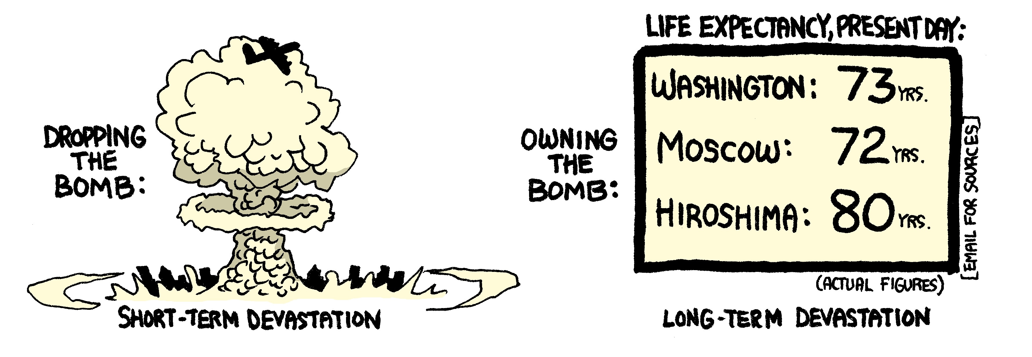
At left, we see the “short-term devastation” from dropping the bomb — a destroyed city. At right, we see a table of life expectancies in the present day, where the lives of those living in American and Russian cities are significantly shorter than those of the occupants of Hiroshima.
My students frequently misunderstood the argument here, believing that Rowntree was trying to argue for some kind of increased longevity as a function of Hiroshima having been bombed. I think it is rather clear that Rowntree is instead suggesting (per the other diagrams) that the United States and the Soviet Union both expended resources on their Cold War militarization at the expense of resources that would have improved quality and length of life of their populations.
The poster is no longer available for purchase in the store for Subnormality, which is a shame. The heyday of nuclear-weapons posters is, I fear, quite over — but it is a genre of artistic statement that I think could be still quite rewarding. What I appreciate most about Rowntree’s cartoon is that its message about the bomb is politically and historically complicated (whether one agrees with it or not, it is not simply a “nukes are bad because they could kill everyone” message, which is a much more common and simple political take on nukes), and that it re-appropriates the visual language of nuclear weapons towards this end.
“D Plus 15 Years; Now It Can Be Told,” Newsweek (19 December 1960), 60-61. The basic concept of the gun-type design was declassified with the Smyth Report in 1945, and the basic concept of the implosion bomb was declassified for use as evidence in the trial against Julius and Ethel Rosenberg in 1951. I discuss both of these (and other “diagram” declassifications) in my book on the history of nuclear secrecy in the United States. I have written a lengthy article on the history of nuclear weapons design diagrams which someday I will get around to getting published…
This comments section sure is weird 😁
Very interesting read, the poster is, unfortunately, more relevant now than in the last 30 years...
... ditto on that comment of the comment section being 'weird'. I'm half expecting David Lynch's visage to emerge on my screen.