Dr. Strangelove's War Room
Could claustrophobic design be a strategic asset?
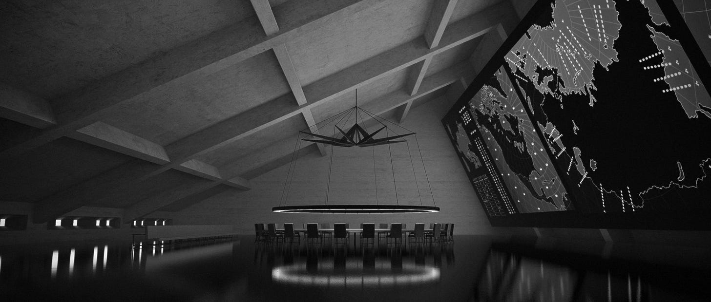
The above rendering of the War Room set from Stanley Kubrick’s Dr. Strangelove, Or: How I Learned to Stop Worrying and Love the Bomb (1964) has been frequently reposted around the Internet as if it were a photograph of the actual set. It is in fact a 3D model made a few years ago by a Dutch artist named Siebe de Boer.
There are, I have noticed, a lot of 3D models of the Strangelove “war room” set out there, as well as a model that was made for a Kubrick museum exhibition a few years back. Out of all of them, I think de Boer’s is the best, as a blend of both hyper-realism and stylization. The reflections on the floor, in particular, really make the piece.
I really enjoy it as an image, and think it’s quite the testament to its success that it is often taken for being some kind of official photograph associated with the film. If you’re getting Doomsday Machines by e-mail, you’ll see I adapted the above into the e-mail header, because I thought it just really fit the vibe I was going for with this blog. I have done this with Siebe’s kind permission.
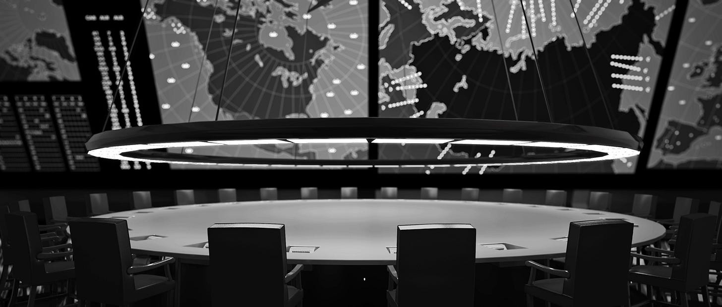
The above is another angle from de Boer’s rendering, which is part of a series of renders he made of movie sets. At this scale, one can see the artifact of it more — the ring light looks much more CGI, for example, than in the wide view. And one is missing the sense of vast emptiness that makes the original so much more effective.
The War Room in Dr. Strangelove was designed by art director Ken Adam, and apparently was hell to light, as Kubrick wanted to use as little additional lighting as possible beyond that provided by the set. In a later interview with Christopher Frayling, Adam was asked about his sources of inspiration behind the famous set.1 Below are some excerpts from the interview:
When I was doodling I came up first with an idea for a two-level set with a gallery around the top, and Stanley liked it very much. So I thought I was in business. I already had people in pre-pre-production working on the set when he suddenly asked, “What am I going to do with the extra level?” I knew I was in trouble again; I was anxious. He was right, of course, because I never thought about what they’d do with a second level. I thought Stanley would come up with an idea. […]
He came into my little office and was standing behind me while I was doodling some shapes. Again, whether I was influenced by German Expressionism or not, I don’t know, but out of my scribbles came this leaning triangular shape with slanting walls. Stanley stopped me and said, “Hold on. Isn’t the triangle the strongest geometric form?” I said, “I think so, yes.” He said, “If we’re going ahead with it, what would I built it out of?” I suggested reinforced concrete, and he said, “Like a gigantic bomb shelter?” So that’s how the idea was born. And you know, I always had this thing about having a circle somewhere. So I designed the circular table. […]
You’ll find a circle in all my designs somewhere. It was Stanley’s idea that the War Room would be like a poker game and he was fascinated by the light ring. He thought we could light the whole scene with that ring. […] We had phony light sources and beams from one wall, and maybe a little fill light here and there. But the main source of light was the ring. […]
…as I was constructing the set, it was my idea to come up with this shiny black floor and these gigantic inclined maps. And I was feeling claustrophobic too! Which was the right element, because the actors felt that strange atmosphere. That’s why I think it was my most successful set, because everybody became part of the set. […]

I had some stills of NORAD, the North American Air Defense, which is a control center somewhere in the United States. Its motto was also “Peace is our Profession.”2 But it wasn’t all that interesting. It was less interesting than space control, mission control [at NASA]. So I said it was no good. So I came up with these gigantic maps. […]
There were a lot of problems, but somehow we always managed to overcome them. The overall effect of the War Room was so real that people in the highest places tried looking for it. I later learned from reliable sources that when Ronald Reagan moved to the White House he asked his Chief of Staff to show him the War Room.
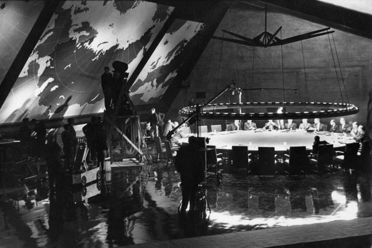
The above “behind the scenes” photograph is interesting inasmuch as it doesn’t really look much different from the filmed scenes or the promo photos — the War Room simply looks as it does, and the cameras are there to film it as it is. It’s a gloriously huge space. The vast brutalism of the interior of the underground stations in the Washington DC Metro (which post-date Strangelove by over a decade) have always reminded me of it (and feel a million miles away from the mostly-cramped New York subway platforms).
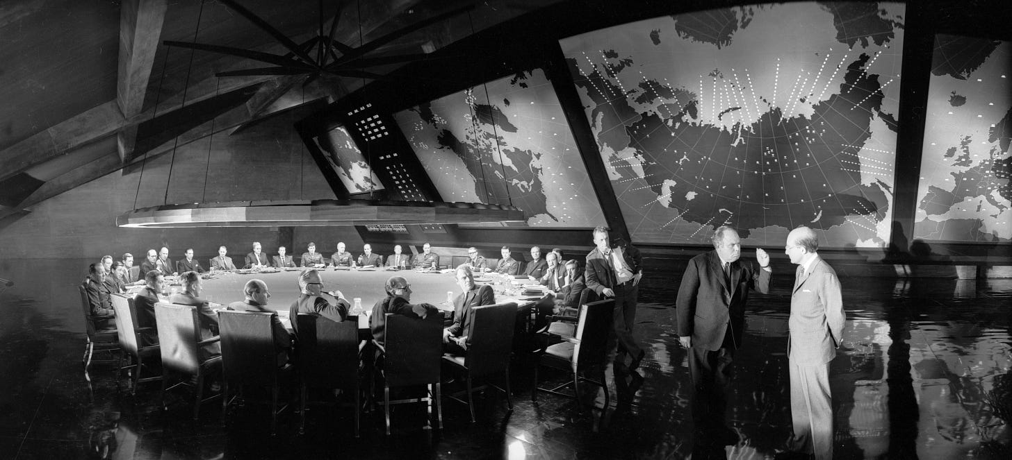
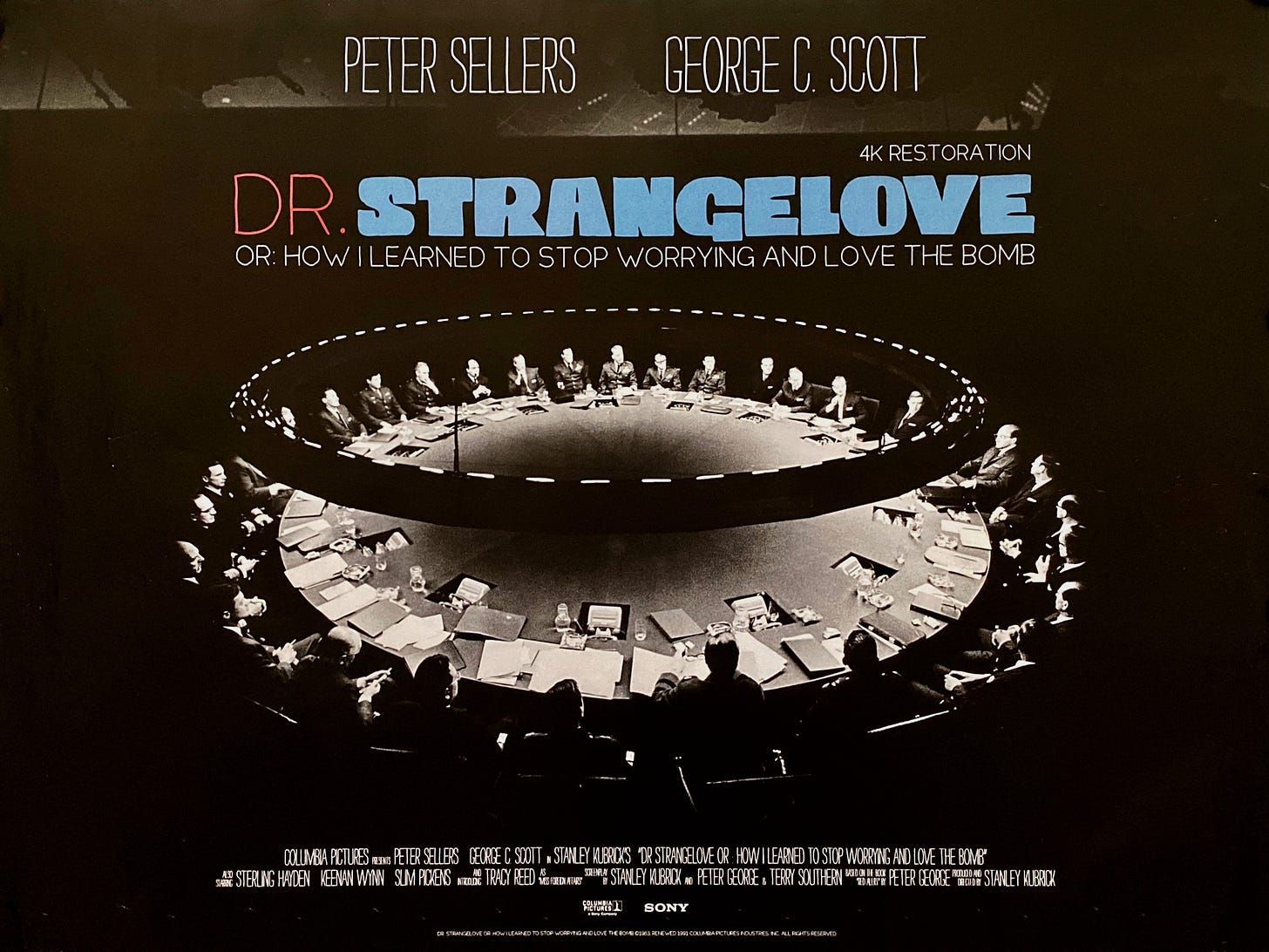
One gets another great view of the war room table in the above poster, made for its 4K restoration. At that angle, the circular nature of it really evokes the idea of a clock, although, as claimed by Adam, Kubrick’s real interest was in evoking the image of a poker game. Very aesthetically appealing… if in reality, pretty impractical. Imagine trying to have a conversation across that thing. It’s enough to make you want to get into a fight in the War Room.
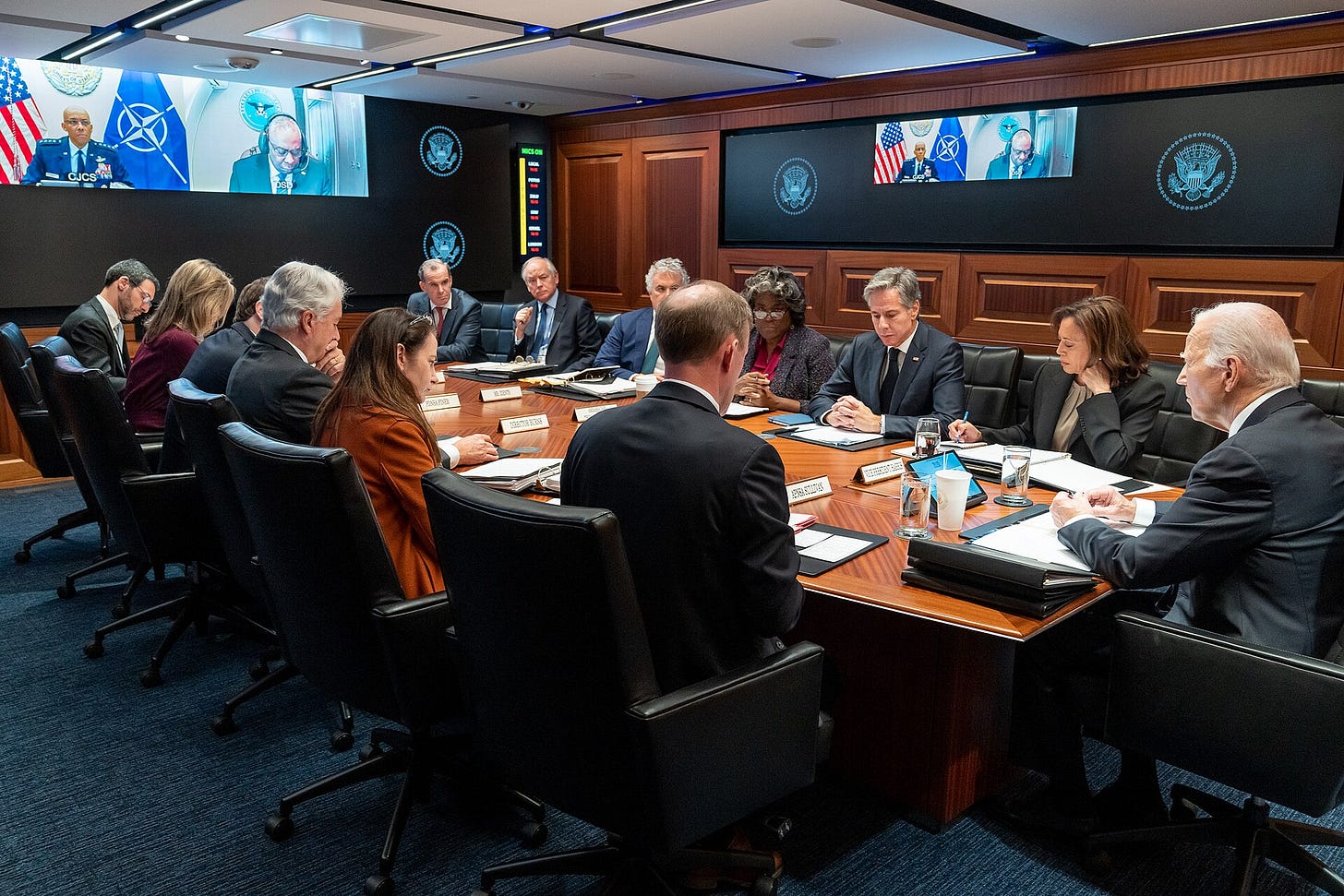
The actual White House “Situation Room,” as seen above in its most recent incarnation, is dramatically less interesting. No doubt it is more functional than the War Room from Dr. Strangelove. But it really does lack style. It’s (superficially) just another conference room.
Would having more style in the War Room be a good or a bad thing? Would it encourage those inside of it to take their responsibilities more or less seriously? Would this provoke more or less belligerent behavior? Working with social scientists over the years has made me think that this is the kind of question that could be interesting to study empirically.
I think Adam’s comment about how the “claustrophobia” of the War Room set affected the actors is interesting in this respect. I think “claustrophobia” is an interesting term in general to apply to the War Room set, as one doesn’t normally associate large spaces with claustrophobia, but large-spaces-with-deep-shadows-at-the-edges could be the difference, there. I think that actual White House Situation Room looks pretty claustrophobic — it feels cramped and subterranean, with its lack of windows, low ceilings, and cheek-to-jowl packing of chairs into the long room. It also feels like a place one would inherently associate with stressful situations. One wonders whether adding a plant or two, or a couple non-overhead lights, would have an effect on international relations…
Christopher Frayling, Ken Adam and the Art of Production Design (Faber and Faber, 2005), 108-111.
Adam was (understandably) confusing NORAD with Strategic Air Command. NORAD is/was in charge of defense operations, SAC was in charge of offensive operations, basically. NORAD’s motto was “We Have the Watch.” But I suspect the images he was looking at were indeed of NORAD, not SAC, just because there were many more images of the NORAD Combat Operations Room circulating at that time than SAC operations. I will do another post on The Big Board in the future that looks at these kinds of images more carefully.


I feel the current *last* image of today's War Room(s) reminds me of the cramped, claustrophobic War Bunkers of both Churchill (you can visit today!) and Hitler (as recreated in Der Untergang). Both were claustrophobic yet luxurious: Churchill AND Hitler both feared annihilation, yet did so while entertaining lavish dinners. Until the end.
Mr. Wellenstein, if you come to Italy, do not forget to visit the Soratte bunker. It is the closest thing to the Strangelove's room that you can find around (at least by us, I do not know if there are similar places in America that can be visited by tourists). Cheers, Emanuele Mastrangelo
https://bunkersoratte.it/index.html