"The battlefield is everywhere"
The wild nuclear maps of "Wild" William Bunge (1988)
When I was an undergraduate, I really enjoyed the serendipity of “mining” the massive, subterranean stacks of the Doe Library at UC Berkeley. One could look up books one knew were relevant to a topic, or search for keywords, but the real unexpected gold was in the stuff next to whatever you were looking for, because of the quirks of the Dewey Decimal System. It’s something that I think is much more alien to students today (though they have their own sources of serendipity, I expect) and the transition to a more search-centric, all-online approach. But that was how I found some truly odd books over time, and a few real treasures in the mix.
One of these was the highly eccentric Nuclear War Atlas by William Wheeler Bunge, published in 1988. Bunge was a “radical geographer” who believed that good cartography could be a political argument in and of itself, and a method for pushing a strong political agenda. He had (I later learned) published a poster-sized version of The Nuclear War Atlas in 1982:
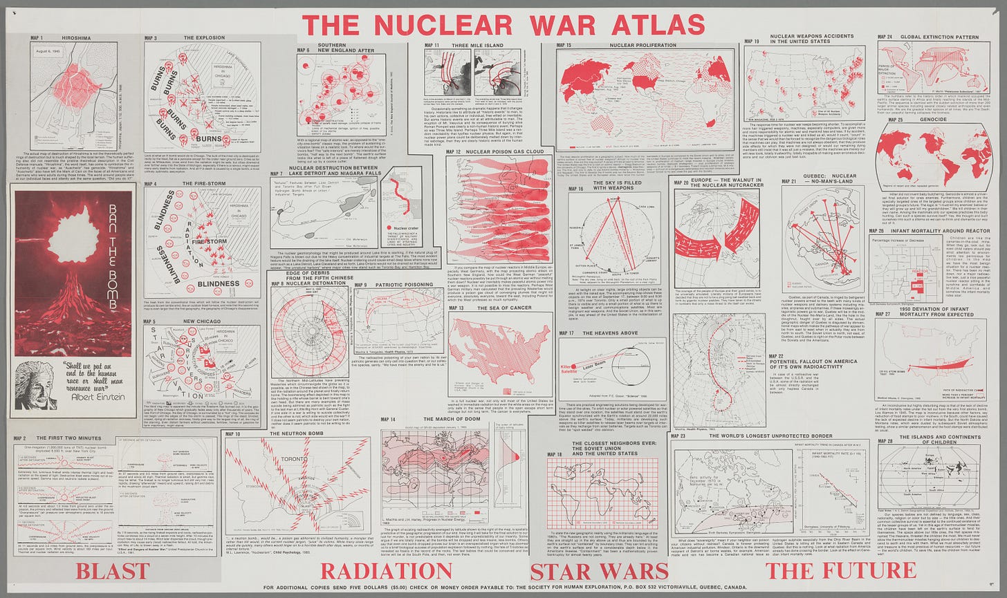
The 1988 book took the same images and coupled them with considerably more text and some additional diagrams, and makes for an improvement, I think, even though the poster is a fascinating artifact in and of itself (if slightly deranged looking, from afar).
Bunge’s aesthetic choices, data sources, and general arguments are very early-to-mid-1980s. Some have aged better than others. A lot of them are adapted from previously existing images, some well-known and some obscure, but put into a common visual language (with the “red is the only color we need” color scheme). For example, this “dot map” discussing the total megatonnage of the global nuclear stockpile is pretty well-known, and pretty effective at conveying the orders of magnitude involved:
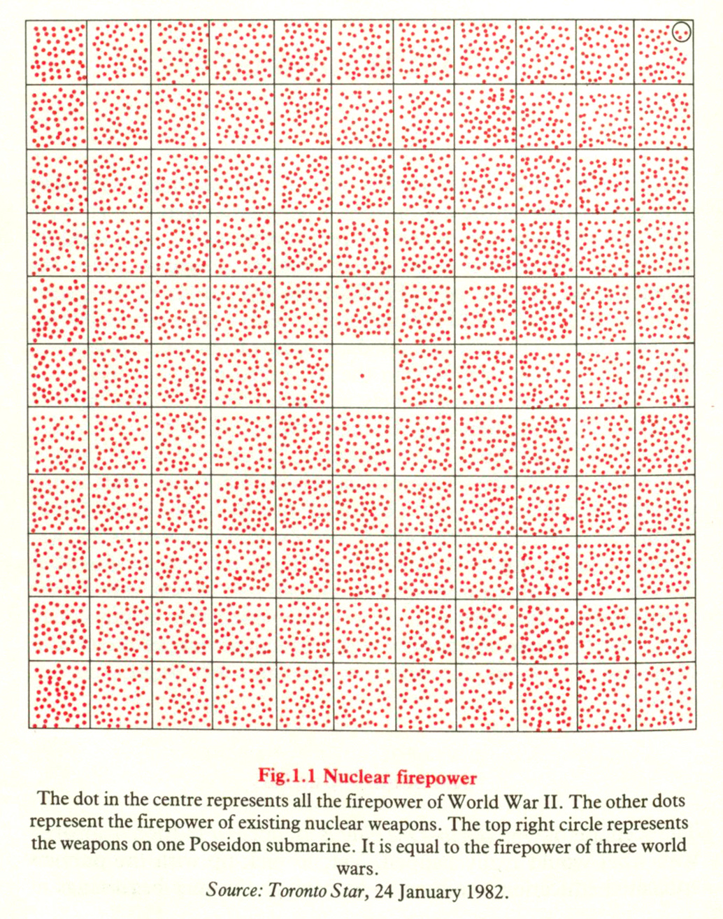
This is an effective image! Is it… accurate? I did some counting and concluded that it’s essentially correct, at least within the error bars of what was known (and not) in 1982 and what we know (and don’t) today.1
These kinds of graphics are sort of a dime a dozen in nuclear publications from the 1980s. The ones that stood out to me are the ones that Bunge himself made, which have a certain unhinged flair to them. He has a series of maps showing the progression of a 20-megaton H-bomb explosion in Chicago (a yield not outside of the possibility of what the Soviets were fielding in the early 1980s), and specifically his use of pictographs makes them stand out quite dramatically from what such maps usually look like:
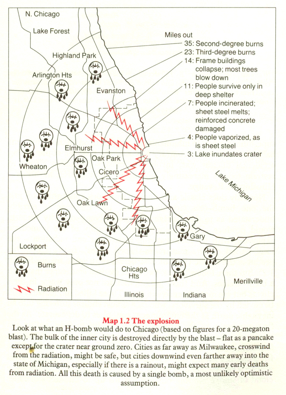
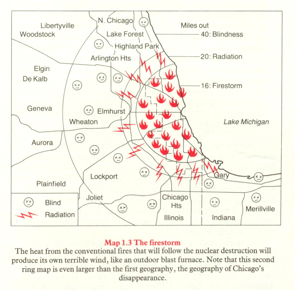

It’s the little faces and labels that have always struck me about these maps. The “burns” and the “blind” and the “insane” and the “marauding zombies” — it’s just something unusual, even for anti-nuclear weapons literature. They simultaneously undermine any sense of serious objectivity while also emphasizing the grim horror of what is being contemplated.
Bunge was plainly trying to both use and subvert the tropes of these kinds of post-attack maps, which were by that point a routine fixture of Civil Defense publications. I’m torn between whether this increases or decreases the effectiveness. It probably depends on the audience.
Bunge’s text similarly makes no pretense of providing sterile analysis:
The “Proximity Argument,” the revolution in our planetary spatial relations, is forceful enough intellectually to match the horrendous situation. “Are we in a biological crisis of existence?” Yes! “How can we prove that?” Because there are no longer any safe interiors in which our babies can survive the next war. The weapons are up. Reproduction will be impossible. The battlefield is everywhere. Therefore World War III is treason — treason to our species, to say nothing of our nations. Species patriots, the humble mothers and fathers of our world, must save our kind. And to prepare for this titanic effort, we first must grasp where we literally stand, the true reality of our space, our modern geography.2
What follows are a few more of the graphics from Bunge that I thought were the most interesting and unusual. I apologize that the scans are not perfectly aligned — I made these some years back with the overhead book scanner at the Library of Congress, and my experience is that trying to get these perfectly aligned is not worth the effort.
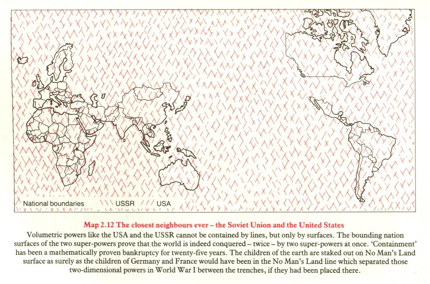
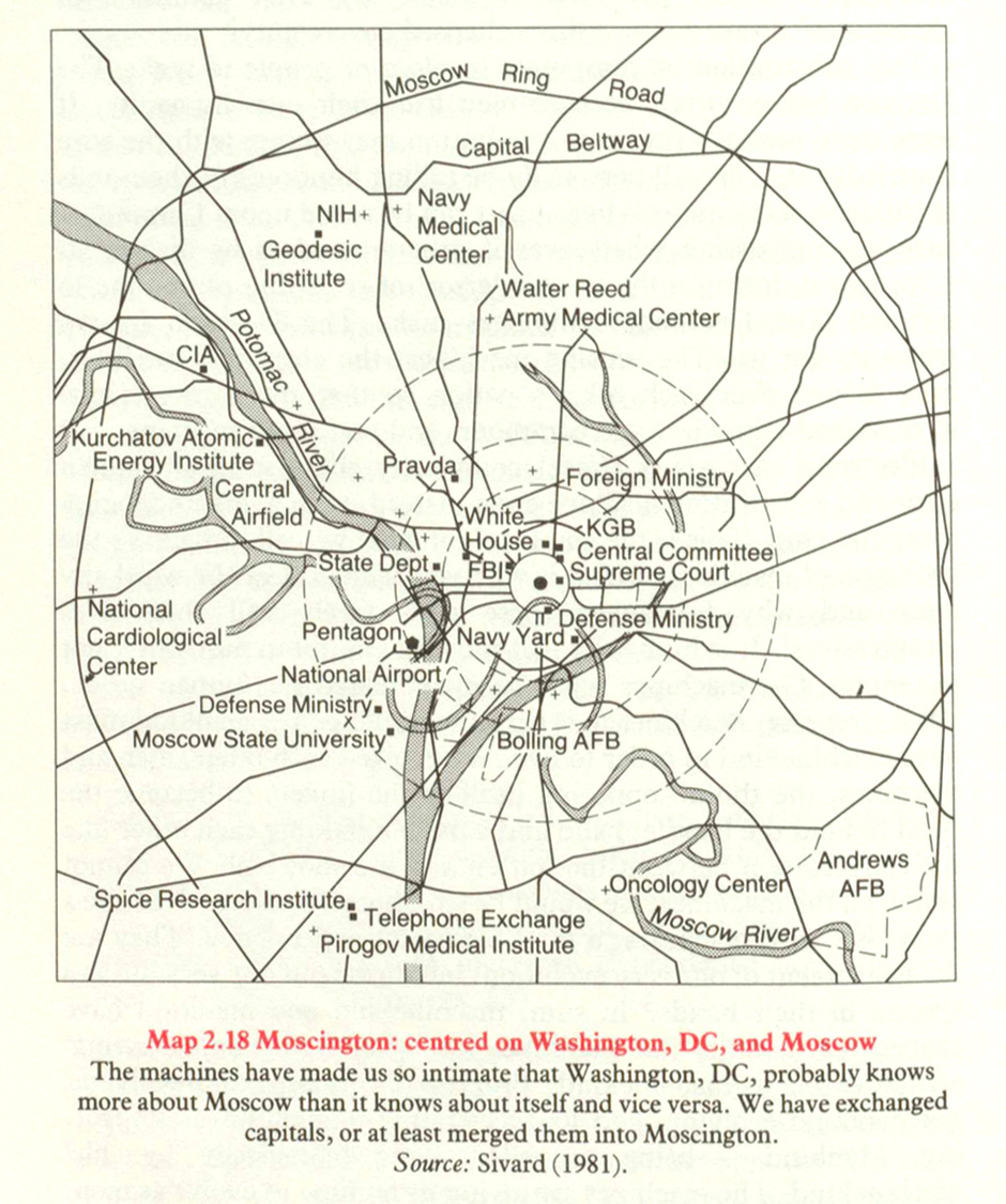

Bunge’s work on nuclear matters is, for both better and worse, creative and bold. Bunge himself had a generally quite colorful and influential-if-unusual career, and was once apparently well-known among geographers as “Wild Bill.” He was born rich, and never quite evolved out of that sensibility (apparently), but had been a a member of the Communist Party in the 1960s (and expelled twice), and had a period of his life in academia prior to a mutual disentanglement. The stories from his friends about his behavior and manner give the impression that he was the kind of person that would euphemistically called “difficult.” I was struck by one line about him in particular, written by a friend of his:
We may never know whether Bill had been driven to madness by sinister hidden forces. It is doubtless that William Bunge was considered “crazy” by many who interacted with him. I would say “obsessed” was more to the point.3
Of course, one might wonder: was Bunge the insane one, or was (or is) the world insane? Well, perhaps “both” is an acceptable answer. Still, there are less productive and interesting ways to be insane.
Each of the 11x11 grid squares (except the center) contains about 50 dots. So that’s 120 squares x 50 = 6,000 dots, 6,000 World War IIs.
The global megatonnage in 1982, the date of the source, was probably some 13,000 megatons. The US stockpile was a bit over 5,300 megatons at the time. We don’t have great data (to my knowledge) on the megatonnage of the Soviet stockpile for that period, but I don’t think it’s unrealistic to assume it was around 6,000-7,000 megatons, given that they still had some very high-yield weapons in their stockpile. And I don’t know of a great estimate for the rest of the world’s stockpiles at that point, but it might have added, let’s say, another 1,000 megatons or so.
So if that’s the case, it means that the chart is assuming about 2 megatons as representing the expenditure of firepower in World War II. I’ve seen estimates ranging from 2-4 megatons for that. All of which is to say that, within the boundaries of the unknowns, that sounds about right to me.
A Franklin-class submarine could carry 16 Poseidon C3 missiles, each of which could carry between 10 or 14 W68 warheads, at 40 kilotons each. So that’s 6.4–9 megatons per sub, depending on the load out. So if anything the chart might be understating the number of dots each sub ought to have by maybe one dot.
William Bunge, Nuclear War Atlas (Basic Blackwell, 1988), 5.
Clark Akatiff, “The last days of William Bunge: 2007-2013,” Yearbook of the Association of Pacific Coast Geographers 82 (2020), 133-144.


Reminded me of a strange book - The Nuclear War Fun Book, by Victor Langer and Walther Thomas. I found a copy (in Spanish) back in the 80´s. It was supposed to be "fun", but its humor was dark as hell. I was scared and surprised to find it was being sold as a book for children (which I was then). Many, many years later, I bought a copy. I still find it incredibly dark, and even a little fun - probably we can call it "aggressive pacifism".
The maps of Chicago are fascinating to me. I grew up in the northern suburbs of Chicago in the late 70s and early 80s with an ex-Navy submariner, nuclear engineer for a father. I always remember him saying that we lived "too far outside the city to be lucky enough to die in the blast if there were a nuclear attack". It was something we would talk about at home very nonchalantly. I gave a speech on "How to survive a nuclear war" for one of my high school English classes complete with Geiger counter demonstrations from the decommissioned fallout shelter equipment from my grandparent's church. They made for curious and unsettling toys for a child, but it was an interesting learning experience. These maps really put that into a much more vivid light.