The perfect horror of Chesley Bonestell's nuked New York
Gritty realism in the artwork for a 1950 article on "Hiroshima, U.S.A."
There have been many, many visual depictions of what an atomic attack on a city might look like, and many, many of them focus on the destruction of New York City in particular. The cultural resonance of New York and its famous skyline, the broad familiarity with its major landmarks and tourist attractions, and its vaunted position as the most highly- and densely-populated metro area in the United States, are probably among the main factors for its prominence in visual media about nuclear attacks, even more so than more obviously political targets like Washington, DC, or Moscow.1
This isn’t even close to a new phenomena. The earliest instance of this that I know about is from a New York city publication, PM Magazine, which published a “what would happen to New York?” image in its August 7, 1945 issue — a day after the Hiroshima bombing:2
The now-famous image of the damage of Hiroshima as seen from the air, with its damage annotated, was not released until August 8, 1945, as I have written about elsewhere.
This impulse, to mirror the attack on the other onto the self, is a fascinating one in its own right. On its face, it is an attempt grapple with the difficult issue of scale, as making intuitive sense of arbitrary diameters is hard for most of us without a visual aid, and using a relatively familiar landmark as the basis of the visualization aids all the more. (Thus, NUKEMAP.)
Dig a little deeper, and there’s something else clearly going on here: a projection of the self as hypothetical victim. There’s something simultaneously empathetic and narcissistic about that, at least in the case of the United States, especially so soon after Hiroshima, but even in general, as for many years the United States was the only nation capable of enacting such destruction onto anybody’s cities, and certainly the most capable nation of doing so for several decades to come.
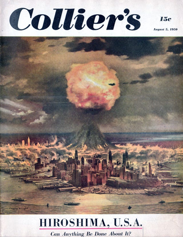
Of all of the visualizations of “what would happen here?,” though, the ones I find most striking are the paintings that were created by the famed science fiction and space illustrator Chesley Bonestell for Collier’s magazine in August 1950 for the 5-year anniversary of the Hiroshima bombing. The magazine, published one year after the first Soviet atomic bomb test had been announced by President Truman, ran a cover story with the evocative title: “Hiroshima, U.S.A.”
Matt Novak has a great write-up of the issue and the story at Paleofuture and Smithsonian.com. But what I want to focus on here is the art work by Bonestell. The cover alone is pretty great, even though it covers fairly familiar ground: a nuclear weapon over Manhattan, almost immediately after exploding. Almost all photographs of nuclear mushroom clouds are within the first minute or so of the explosion, often the first few seconds — that’s when you see the dramatic fireball and blast wave.3
Bonestell’s painting gives a great sense of motion, though. It’s not just a cloud superimposed on a static skyline, and the angle he’s chosen is one that gives one a great sense of visual depth and scale. And, with all of his painting, there is an obvious attention to technical detail, in the sense that the scale is accurate for the type of atomic bombs that were under consideration. Though the US was fielding weapons with twice this yield already, and much larger weapons were right around the corner, most Civil Defense discussion was concerned with “nominal” atomic bombs of about 20 kilotons in yield, the same as used at Trinity, Nagasaki, the Operation Crossroads test, and the first Soviet test.
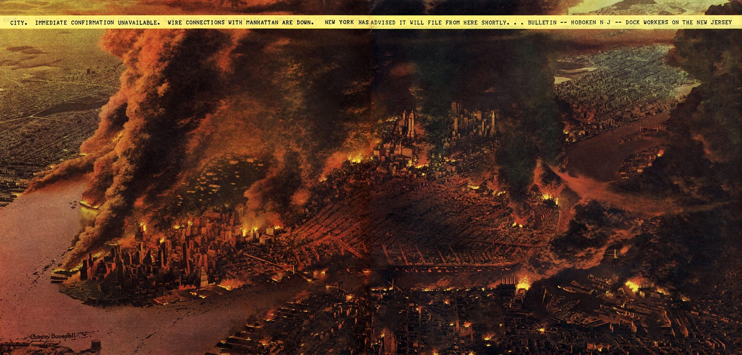
The image above, from the same magazine spread, shows the atomic attack imagined: two “nominal” atomic bombs being used against New York City. The first appears to have detonated somewhere near the Brooklyn/Queens border, while the second detonated in lower Manhattan, across from the Brooklyn Naval yard. In the above photograph, the one in Brooklyn/Queen has detonated perhaps a few minutes before the second one, as its cloud has already “mushroomed,” and appears to have started a few fires near Roosevelt Island and in midtown. The Manhattan bomb is detonating, relatively low, and exhibits what might be a condensation cloud. Its blast wave is palpably visible.
Bonestell’s commitment to realism is what sells the image. It’s dramatic, but not absurd. It doesn’t look like science fiction. It looks like what you’d imagine it might actually look like, were it to happen, if you could see it from an airplane a few thousand feet above the city.
But the real showcase image is the one above, a two-page spread showing the aftermath a few hours later. Here there are no mushroom clouds, as those stabilize and blow away within 20-30 minutes after the detonation. Instead we have the dark columns of smoke from the secondary fires, which have clearly been raging.
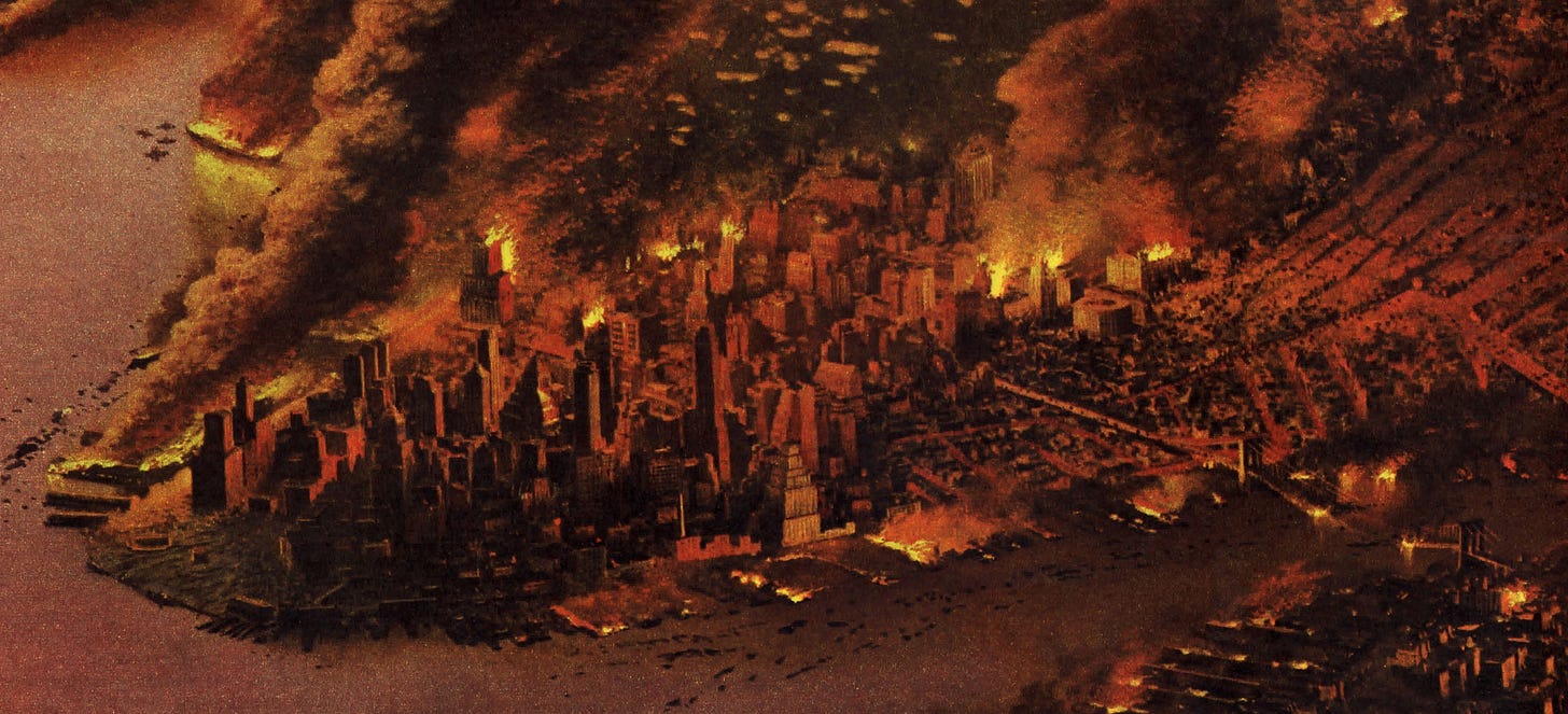
I’ve spent a lot of time trying to get a scan of this image that does it justice, carefully disassembling an original copy of the Collier’s issue and performing some Photoshop magic on it, to more or less good effect.4 Aside from the overall gestalt, the details are excellently rendered. Here’s lower Manhattan, near Battery Park:
The burning, the buildings, the destruction of the Brooklyn Bridge, the sense of ongoing fires and horror — just wonderfully done. It’s not a landscape that has been sterilized and swept clean. It’s an ongoing event, a horror that persists, with a choking, gritty flavor to it. The landmarks are there, but they aren’t the focus of the attack, or the image.
Moving up to midtown, Bonestell works in the Empire State Building, though it’s almost a Where’s Waldo situation for it, among the carnage. South of it, one sees how the lower East Side has been reduced to unrecognizable rubble by the effects of the blast, and possible secondary fires which have already swept through it. This is, again, pretty realistic for the scenario contemplated.
And as someone who lives and works on the other side of the Hudson River, I think it’s interesting that he chose to show it, as well. The Jersey City and Hoboken docks appear to be on fire, and there is a burning cargo ship in the river itself. But by and large, one can see that the effects of the bombs are bounded: once you get beyond the waterfront, the direct physical damage decreases rapidly. I imagine that I can just about see my house from there, which is a little under a mile and a half from the waterfront, and we would be, in a totally comparative sense, “fine.”
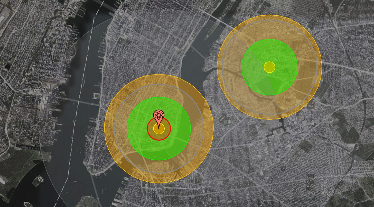
Here’s a somewhat stylized version of what the NUKEMAP says this attack imagined by Bonestell would look like:5
The distances are about right, for the various effects — light damage from the second bomb possibly all the way into Jersey City and Hoboken, intense blast pressures and thermal effects near the points of detonation. NUKEMAP’s casualty model suggests that if this happened today, the total injured could be a bit over a million people, and the total dead would be around 256,000 people. For a point of reference, there would be nearly 3 million people within the areas designated by the “light” blast range radius, and the total population of New York City is about 8 million people, and the New York metro area is over 20 million people.
What make Bonestell’s paintings stand out for me, aside from their attention to both visual and technical detail, is that they excel at giving that sense of scale. One really gets a sense for exactly the level of horror this particular kind of attack might be, at least as much as a sense as one can get from the air. The text and other images in the full article try to fill out more of what that would look like on the ground, which is, of course, just as important for making sense of such an attack.
Again, for the weapons contemplated — not inappropriate for the moment at which this was written, when the Soviet arsenal was in its early days — one gets the sense that this attack would be a tremendous, horrific catastrophe, but still quite limited compared to the total destruction that is and was often imagined. Now, if one were to draw this scenario for a different period of time or attack, such as multiple, megaton-range weapons in the later Cold War, the picture would look pretty different. But for 1950, this is just about right.
There is a marked tendency in most media to overstate the effects of singular weapons. I understand the impulse. But my sense is that the net effect is a numbing sensation in the audience, that “unimaginable, uncomprehensible” sensation so often reported. Making the attack feel more grounded in a human scale, in a tangible reality, makes it more legible — and in that sense, a lot more horrific. The attack scenario in Collier’s isn’t an event in which New York City just winks out of existence, instantly. It gives the sense of a long, unfolding, ugly tragedy. Bonestell’s paintings capture that absolutely perfectly.
Mick Broderick and Robert “Bo” Jacobs wrote a wonderful writeup of an exhibit on “Nuke York” some years ago: Mick Broderick and Robert Jacobs, “Nuke York, New York: Nuclear Holocaust in the American Imagination from Hiroshima to 9/11,” Asia-Pacific Journal (5 March 2012).
The is not the first “circles of death on a map” graphic, however. From what I can tell, that distinction goes to a small diagram in the Chicago Tribune, also published on August 7, 1945, showing the difference in destruction between a conventional bomb and an atomic bomb. Credit to John Ptak for finding and writing about the image from PM back in 2010. I’ve tried to clean up his scan a little bit.
And it’s worth noting that Bonestell would have had precious few photographs of clouds to go off of, as the United States had, by this point, only tested and used a handful of weapons, and the distribution of photos for many of them was highly controlled. It would be interesting to know what reference photographs Bonestell looked at or had access to. My guess is that he based them mostly on Operation Crossroads (1946) photographs, just from their appearance, visually.
If you want to see it at full resolution, here is a link (warning: 13 MB file).
I’ve set the height of burst for the first bomb to be optimized for the 5 psi blast radius, and the second bomb I’ve set somewhat lower, optimized for the 10 psi blast radius. This is acknowledged as somewhat arbitrary, as are the exact detonation points.





The illustrations are so vivid that they look like representations of a historical event rather than a possible calamity.
The British used a 20kT "nominal bomb" in their Civil Defence planning too.