
What if NUKEMAP had been made in the 1960s?
The Weapons Effects Display System (WEDS), Part I

It’s 1965. Beatlemania is in full swing. The Cuban Missile Crisis is three years in the rear-view mirror. US marines have just landed in Vietnam.
And a group of scientists and engineers at the Systems Development Corporation, in sunny Santa Monica, California, have just finished a preliminary study at the behest of the Lawrence Livermore Laboratory on a new kind of computer. In their report on the work, they explained the problem they’ve been trying to address:1
Weapons design scientists, military strategists, field commanders, civil defense authorities and other personnel using nuclear weapons effects data currently must go through a tedious, time consuming process to solve the various problems associated with their work. Solving problems of this type usually involves the use of numerous charts, tables and graphs in a rather unwieldy procedure that requires frequent interpolation and transformation of data. Besides being difficult to manage, the existing procedures are so drawn out and the data so abstract that it is extremely difficult for interested personnel to acquire a comprehensive grasp of what happens in the real situation. The functional relationships that exist between weapon characteristics and the effects they can achieve remain buried in abstraction.
This is true. While there were (and are) unclassified books that explain nuclear weapons effects, the process of manually using the equations and graphs contained in them to generate specific results is incredibly tedious. If one wanted to know, for example, the distance at which a given amount of blast pressure (say, 5 pounds per square inch, enough to destroy most civilian structures) extended from a given nuclear explosion at a given height of burst in the air, one might crack open Samuel Glasstone and Philip Dolan’s The Effects of Nuclear Weapons, 3rd edition (1977), which contains several useful charts to aid in this work, such as this one:
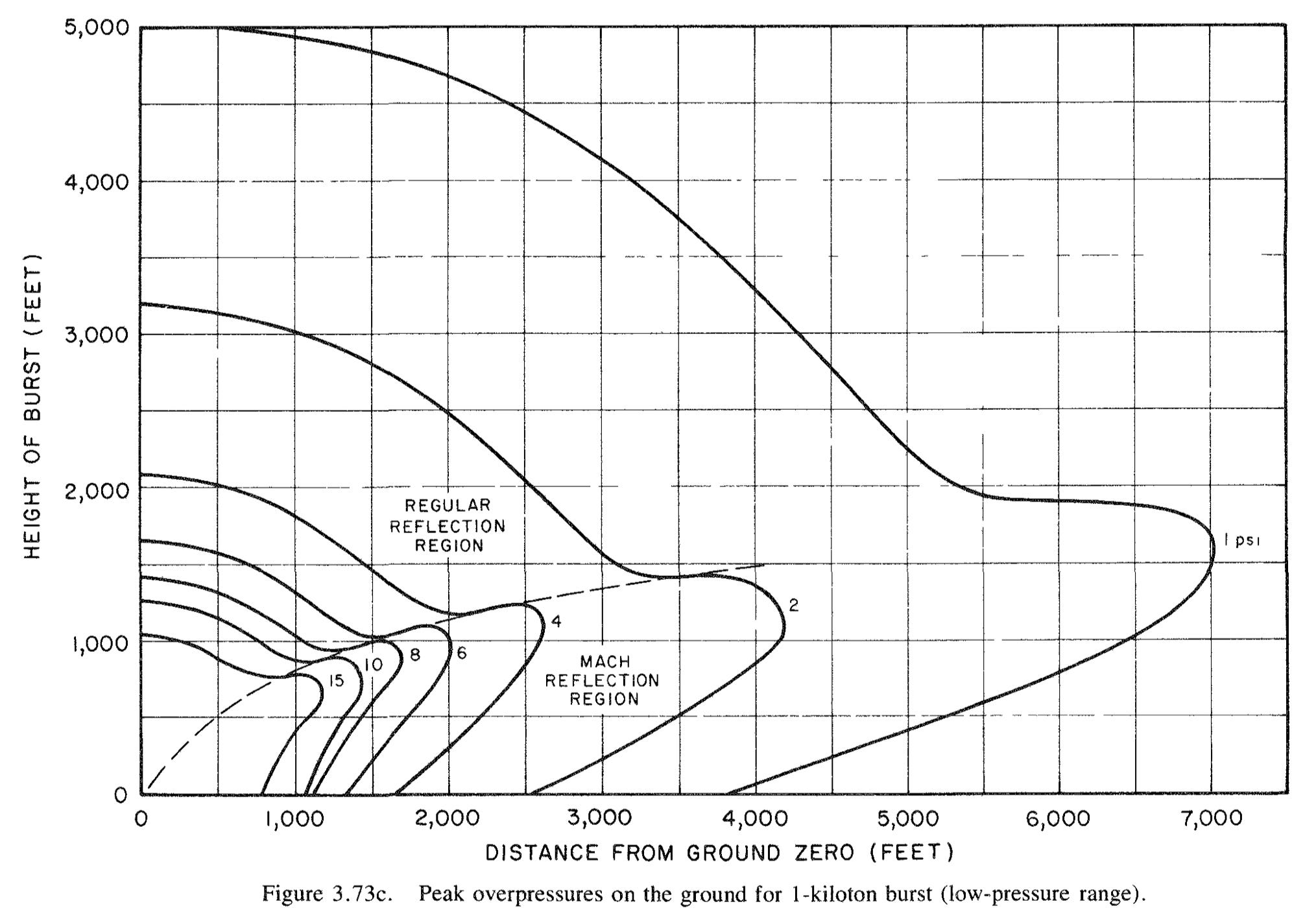
This “knee” chart, so called because of the way in which its curve jut out, is showing the relationship between peak overpressure, the height of burst of a nuclear detonation, and the distance at which that blast pressure would be felt. It is all for a 1 kiloton explosion. The “knee” shape is caused by the fact that at certain heights of burst, the blast pressure of the explosion reflects off of the ground in ways that increases its strength dramatically (a phenomena known as Mach reflection).
So imagine that we want to know how far the 5 psi overpressure range extended from the Little Boy detonation at Hiroshima, which was a 15 kiloton weapon detonated at about 2,000 feet. We would first convert the actual height of burst for a 15 kiloton weapon to a scaled height of burst for a 1 kiloton weapon using the cubic root relationship for blast scaling:
h´ = h / (W1/3) = 2,000 / ((15)1/3) = 400 feet.
Then we would look at that graph up above with a ruler at the height of burst (y-axis_ for 400 feet (which we would have to eyeball, since the scale only shows us increments of 500 feet). We then go across from there to a spot about halfway between the 4 psi and 6 psi curves. We find that it is it a bit more than half of the way between the ground distance (x-axis) between 1,500 and 2,000 feet. Let us say 1,800 feet. Then we have to re-scale that back to 15 kilotons:
d = d´ × (W1/3) = 1,800 × ((15)1/3) = 4,439 feet.
Which is about 0.8 miles. Now, there’s sufficient wiggle room in there in our eyeballing to introduce a lot of error. But this is the easy way to do this kind of thing — to actually try and calculate it from first principles is much, much harder.
Of course, if we were really smart, we wouldn’t do this by hand with graphs. We’d use a “pocket-computer,” like the “Nuclear Bomb Effects Calculator” that was tucked in the back of the Glasstone and Dolan book:
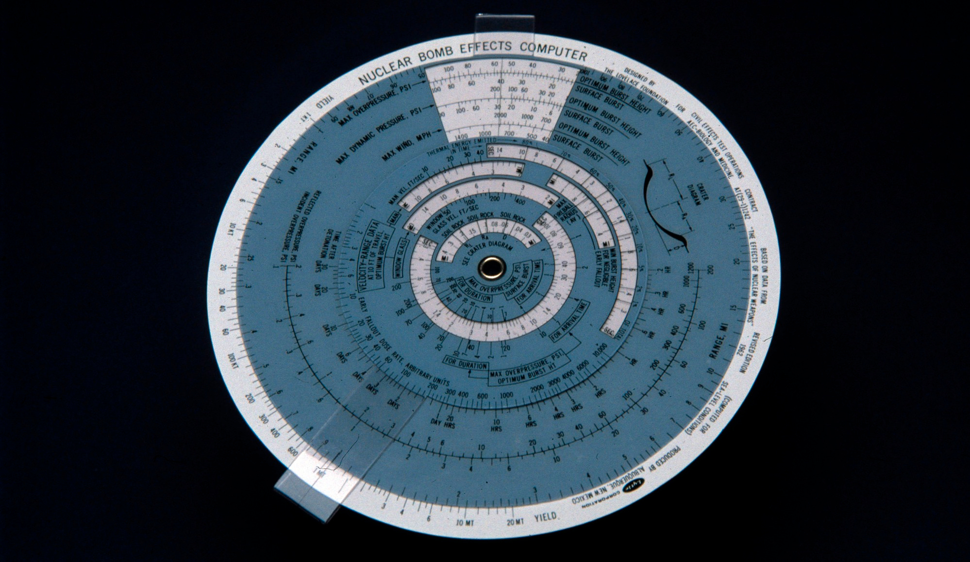
Which is a nomograph, basically an interactive graph, which allows you, by spinning its little discs and lining them up properly, to approximate the same process we just went through more quickly. But even this takes a bit of time (and experience), and trying to imagine doing this for multiple effects, and multiple detonations, and so on, gets very tiresome, very quickly.
So that is the problem — it is tedious to do these kinds of calculations, and these kinds of calculations are important if you are trying to think seriously and precisely about the effects of nuclear weapons.
To remedy this, Livermore contracted with the System Development Corporation to explore the possibility of creating what was called the Weapons Effects Display System (WEDS), a computer system that would not only do these calculations for you with minimal effort, but easily and intuitively show you the output of them.
Computers are very good at math. Making a computer that can solve the above sorts of problems is not that hard. But making a computer that is easy to use in the 1960s was not easy, and making one whose output was intuitive and graphical was extremely difficult, especially at the time! And what they had in mind was drawing these effects on maps, which adds another gigantic level of difficulty to the problem.
The SDC report explains that they considered several possibilities. Wouldn’t it be neat if it could show you a crumpled house in the right blast area? Yes, but it wouldn’t be very feasible. Wouldn’t it be neat for it to be portable? Well, sure… but unless you consider a washing machine “portable,” it was pretty hard to do “portable computing” in the mid-1960s.
Ultimately they concluded that you could do it with the right combination of computational power, display technology, and specialized, analog controls that would be designed around the considerations of the end user. Here was the proposed physical setup of the display and control units:
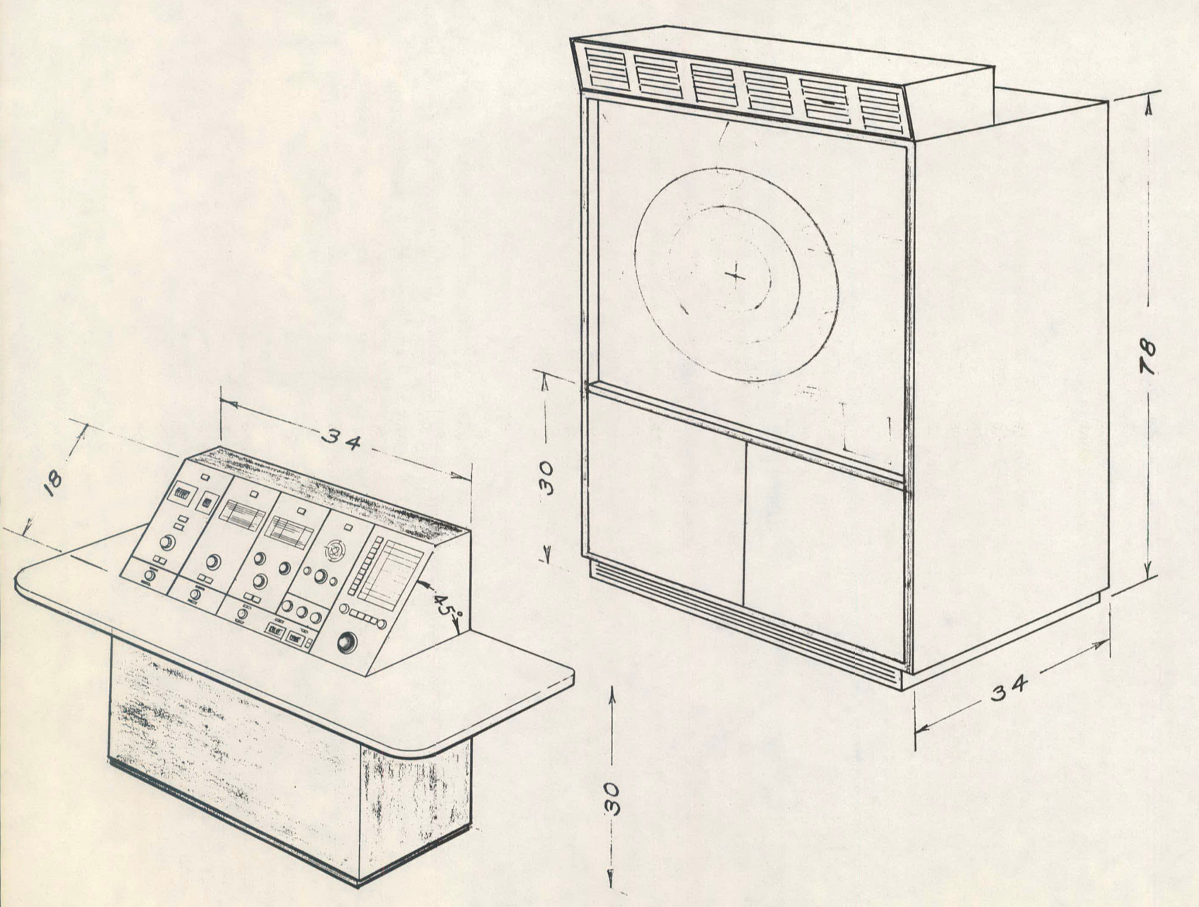
An operator would sit at the Star Trek-looking console at the left, pushing buttons and twirling knobs, and the results would be displayed on that Star Trek-looking display behind it. (The original Star Trek premiered a year after this report was finished, by the way. The more likely inspiration were things like the NORAD and SAGE consoles. Compared to those, this is portable.)
Their tentative control panel would look like so:
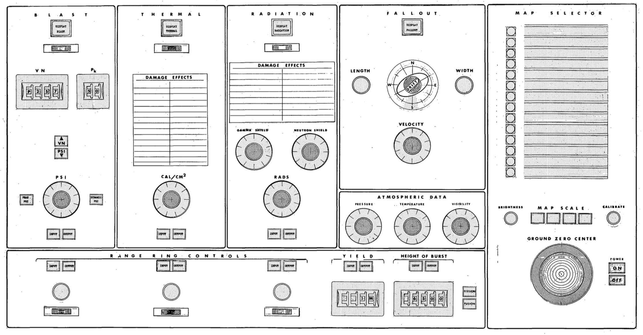
As you can see, their plan was to show quite a number of important nuclear weapons effects. At left, you have the blast effects. (VN is the “Vulnerability Number,” a specialized number allows a user to specify the “hardness” of a target; Pk is the “kill probability”; PSI is the raw blast pressure. One could either use VN/Pk, or PSI.) To the right of that is the thermal effect, the radiant heat from the explosion (in calories per square centimeter). To the right of that are the acute ionizing radiation effects, including knobs to take into account shielding from certain forms of radiation. And to the right of that were a knobs to account for nuclear fallout, primarily by manipulating wind conditions. At the very bottom are controls for the explosive yield and height of burst, as well as what looks like a toggle between “fission” and “fusion,” which presumably would impact how the fallout was calculated.
At the right is the really ambitious part: they wanted to include maps. That is, their approach to making these effects intuitive was to display them on a map. As they explain:
The solution is to be shown in numerical terms as well as .in a pictorial format relating the situation to the physical world, as represented by a map or aerial photograph. The pictorial display depicts the radial distance from ground zero to which specified weapons effects extend .
This had been done since the 1940s, of course: it was what one usually did with things like overpressure and fallout data — draw it on a physical map. But adding maps as part of the computer system added a huge amount of potential complexity: the entire world makes for a lot of data! The idea is that the user would load the computer up with a variety of slides of maps, and then they could, using the map selector, toggle between them. If the maps were at pre-set scales, then the circles, fallout, etc., could be drawn to the correct scale. The bit labeled “Ground Zero Center” on the control panel was a trackball (a “rolling ball”) that would allow the map display itself to be moved.
If you put it all together, here’s their idea of what the visual output would be:
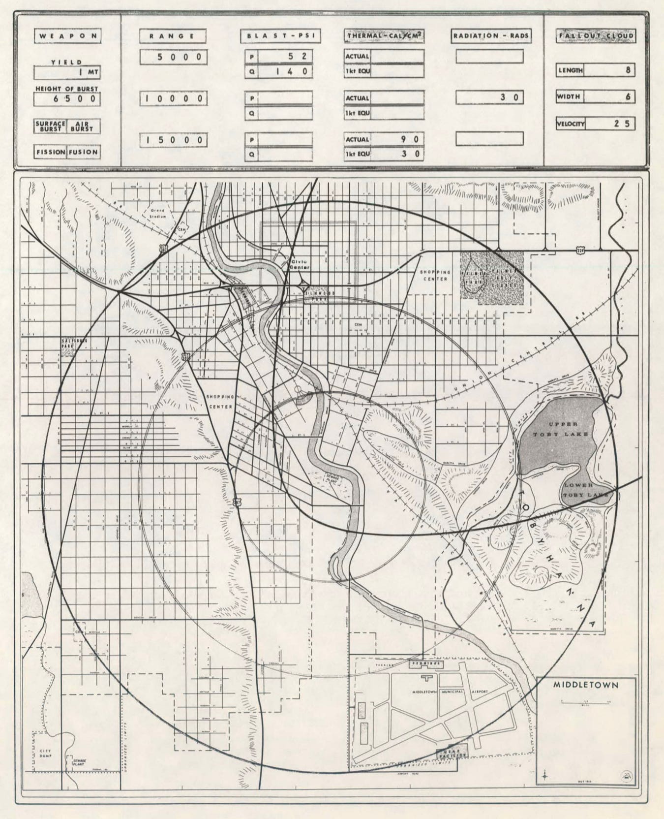
It’s the classic “circles on a map” drawing of nuclear weapons effects — but this one would be dynamic, easy to instantly change parameters of without tedious hand calculation. Being able to do this kind of work quickly and easily changes the game: it widens the audience who could use this information, and lets them immediately see the answers to a barrage of questions about nuclear effects without the cost of time.
NUKEMAP. It’s NUKEMAP. But in the 1960s. I was gobsmacked when I saw the reports on the Weapons Effects Display System for the first time, a few years back, because every aspect of it is hauntingly similar to the thought processes that went into programming NUKEMAP over a weekend in 2012. But in the 2010s, there were mapping APIs that were free to use (today, it’s a bit more complicated than that!). People carry around computers on their person that are tens of thousands of times more powerful than the supercomputers available in the 1960s. “High level” programming languages exist that make it much easier to do all sorts of programming tasks.
In 1965, every aspect of this thing, from the physical console to the means of generating the display output, had to be basically cooked up from scratch. Combining computer output and maps was still pretty novel. Trying to do it cheaply and compactly was very novel, indeed. The seemingly simple question of of “how do you dynamically draw a circles on a map?” invited them to look into a number of different possibilities. Here’s one of them, called the “moving cone projector,” in which they would use moving parabolic mirrors to produce their image:
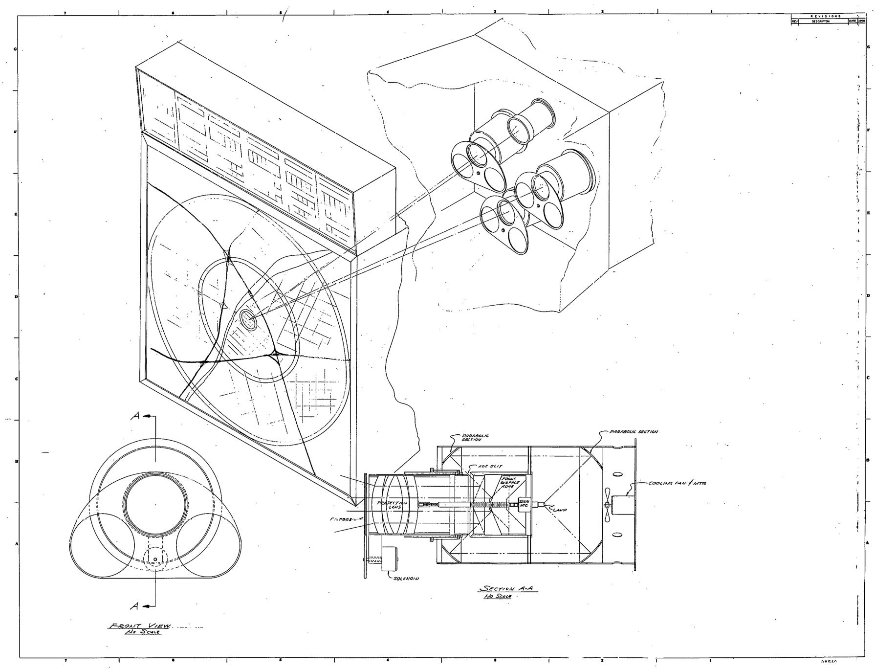
This “moving cone” method — which I am not savvy enough in either optics or electrical engineering to really understand — would, they say, be reliable, but the circle edges would be pretty blurry.
Another approach imagined a triangular bundle of fiber optics (very cutting-edge for 1965!), which could be rotated and manipulated to project circles (somehow):
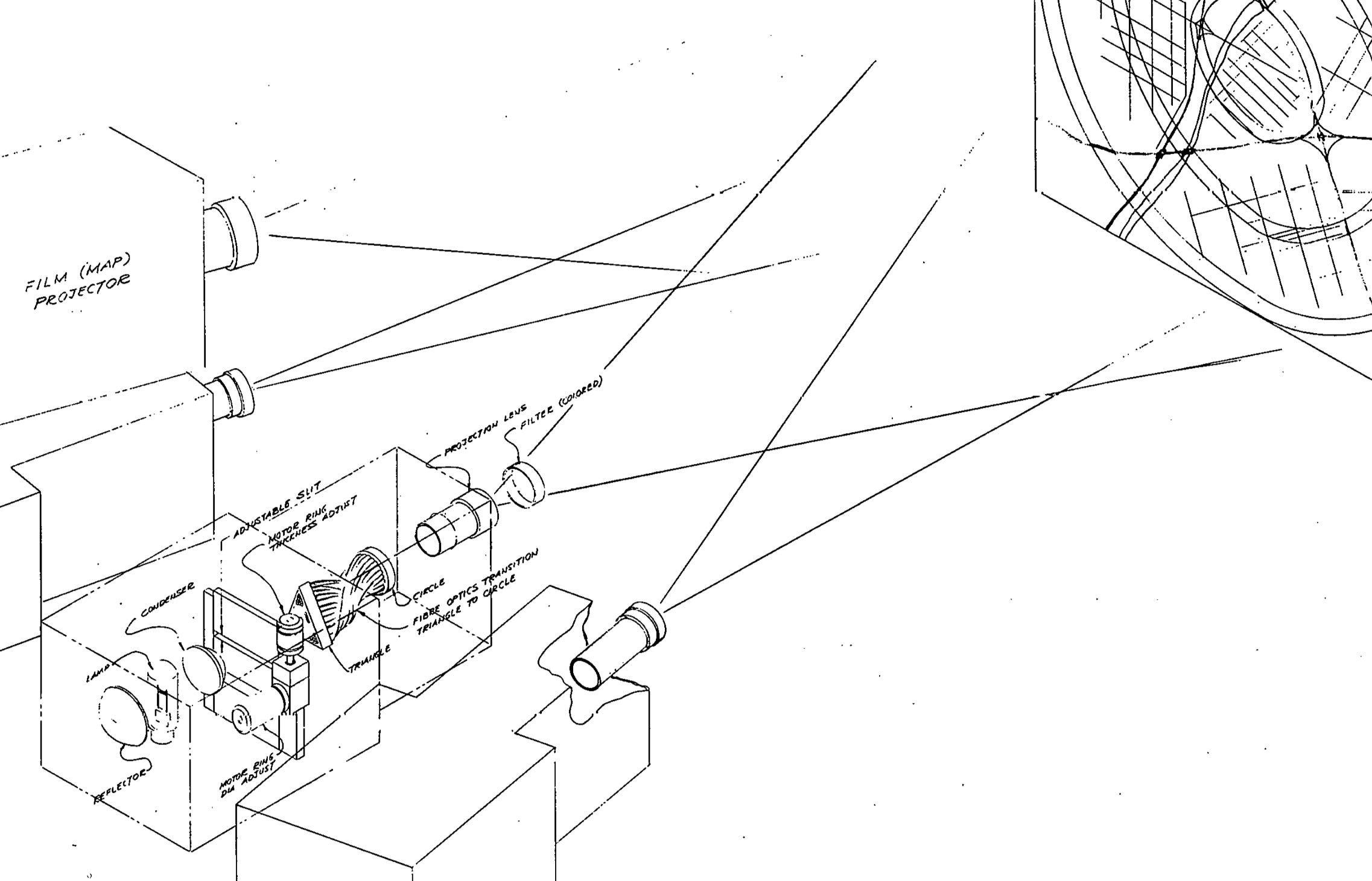
The fiber optic approach was the one they deemed “the most promising approach from the viewpoint of elegant simplicity of operation,” but it was also expensive — $5,000 for the bundle alone. But of all of their imagined systems, this was probably the cheapest, even if getting it figured out would be harder than some of the more tried-and-true approaches, like using film projectors (they imagined having four projectors, at a cost of $2,000 film apiece). They don’t give any estimates for the total cost of the machine. It seems not cheap. The map projector would cost something like $1,600–$2,400 by itself.
Those prices would feel pretty expensive even if those were the modern costs. To translate those numbers into present day currency, multiply them by a 10. So the cheapest method, the $5,000 fiber optic bundle, is really more like $50,000. Per unit. So what would the full hardware cost be for this? If the map projector and the circle projector cost $70,000, what’s the cost of the computer unit, and the physical consoles? It’s easy to imagine each unit costing $100,000 or so. And that doesn’t include labor, or whatever costs were spent on this preliminary study.
The costs associating with making, maintaining, and hosting NUKEMAP have added up over the years, but if had cost me $100,000 just to get it up and running… it never would have happened!
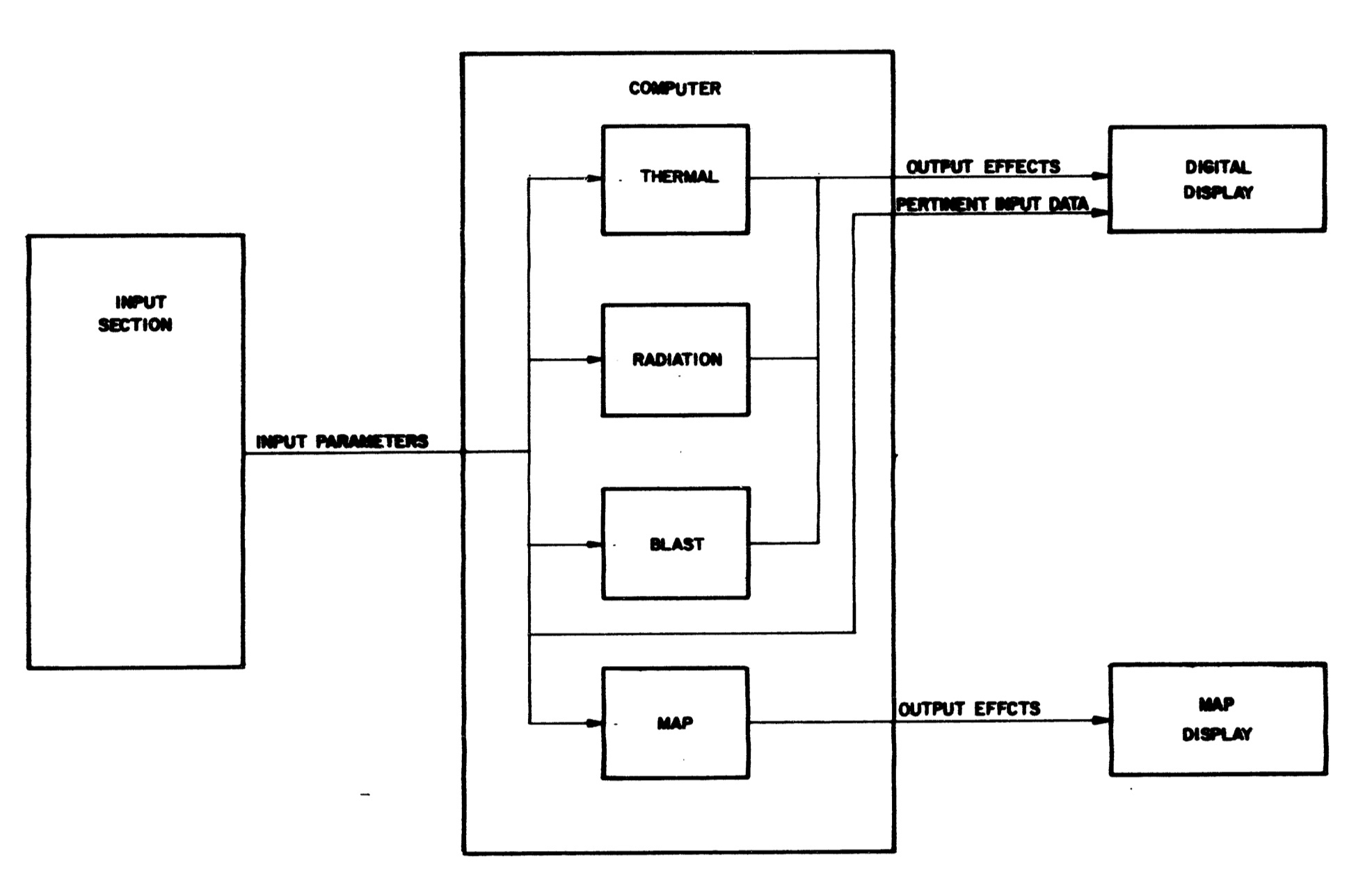
There’s just so much hardware. They couldn’t abstract any of it away. That’s the main issue at every level, from the physical components to the actual programming. SDC didn’t describe the computer unit at all, other than to say they imagined it would be analog. That work would be done by a different contractor, the famed firm of Edgerton, Germeshausen, and Grier (EG&G), who had deep experience photographing and doing diagnostics of nuclear weapons tests. EG&G produced its own report on how the computer system, featuring this lovely block diagram of the WEDS system as a whole:2
To get into the details of EG&G’s described programming would take up a lot of space that only a few readers, I suspect, would appreciate (if you’re in that group, read the report), but it’s fascinating from the perspective of a modern programmer. For example, the complex curves involved with blast pressure, which do not have exact numerical solutions, would be represented on “mechanical cams” which would rotate as necessary so that their values could be read off of them electronically. Amazing. There were also a whole host of amplifiers, optical filters, and other electronic devices that I have a poor understanding of, as someone whose only experience with this kind of thing is software.
So far, the above describes the concept of a computer system. Surely such a thing would be too extravagant, too complicated, too unclear of its benefit to get built, right? Well… about that…
They actually built not one, but TWO versions of WEDS. And get this: they were technically portable! For more on that, read part II of my series on WEDS…
R.L. Henderson, J.C. Campbell, H.F. Gaydos, S.G. Kester, “Final report: Weapons Effects Display System Study,” System Development Corporation, TM-2622/000/01 / UCRL-13189 (7 September 1965).
A.R. Wilson, “Preliminary Design Specifications for the Compact Weapon Effects Design System,” EG&G, EGG-1183-1257 (15 August 1966).
Well now I'm imagining a game where you have to hurriedly calculate overpressure & radiation maps for first responders during a nuclear exchange...using this thing
Those electromechanical analog computers were actually pretty common in those days. See also this 1955 air-data computers for example: https://www.righto.com/2023/02/bendix-central-air-data-computer-cadc.html